What is the Dukaan Analytics dashboard?
The Dukaan analytics dashboard gives us a very detailed analysis of the:
- Sales
- Traffic
- Products.
(Note: In this article, we will go over how we can analyze the Traffic of your store using the Analytics dashboard.)
How to analyze your store's traffic?
To analyze the sales of your store, click on Analytics on your store's dashboard. Upon clicking on Analytics, click on Traffic.
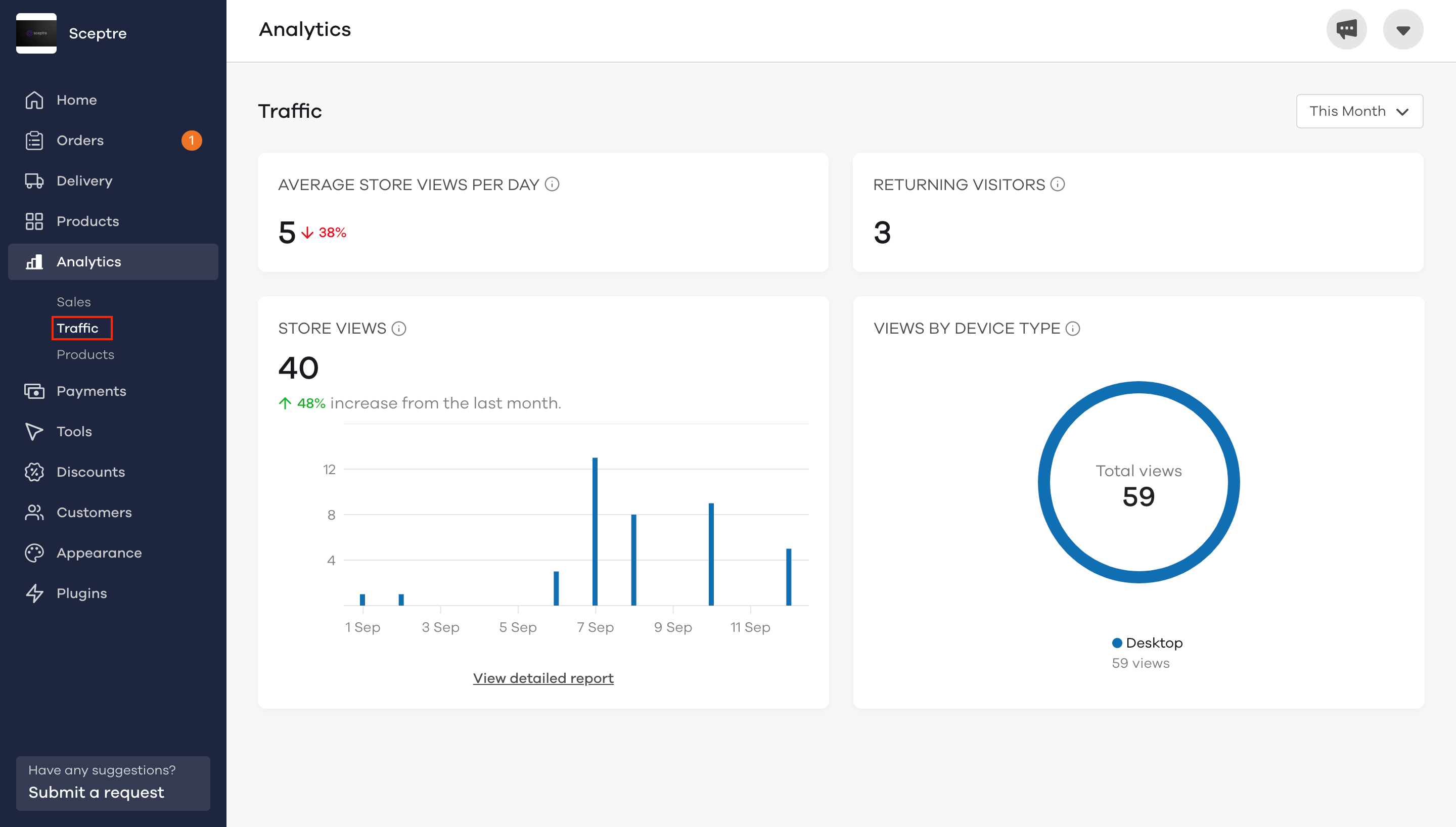
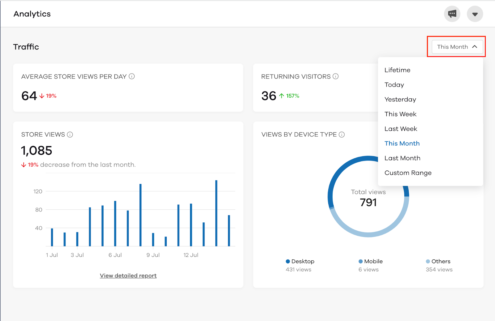
The traffic dashboard shows a brief overview of the store traffic. With various categories like;
- Average store views per day
This is the average count of times the content of the home page is loaded or re-loaded per day in the selected period of time.
- Returning visitors
Here, you can view the total number of users that visited your store more than once in the selected period of time.
- Store views
In this field, you can view the total number of people who have viewed your store over the selected period of time.
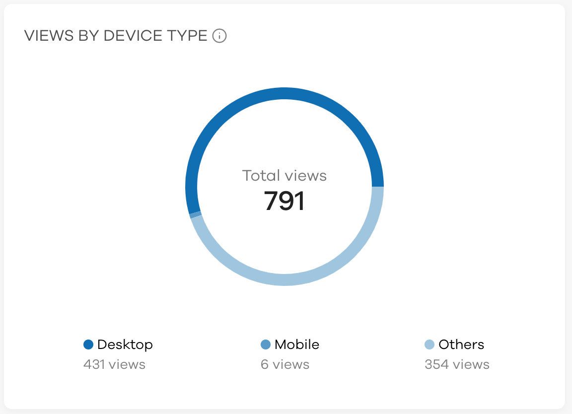
- Views by device type
Here you can view the comparison of different types of devices via which your store has been viewed. The Analytics dashboard also provides a graphic illustration of the views which can be viewed as follows:
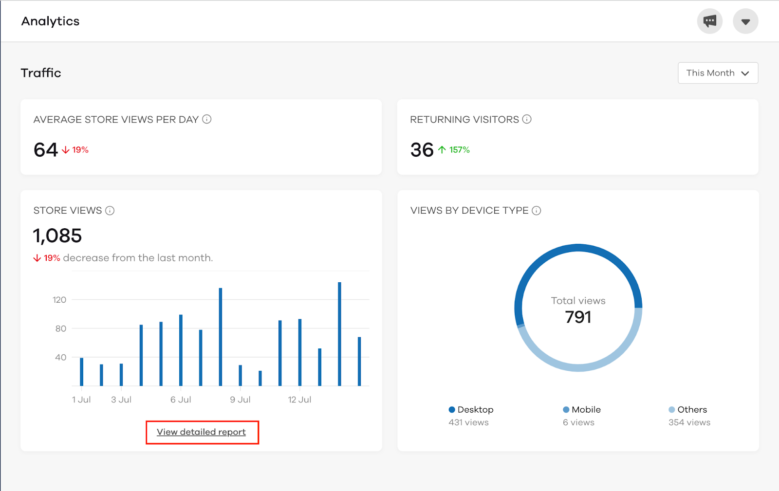
How to view the detailed reports of your store's traffic?
To view detailed reports, click on View detailed report on the Analytics (Traffic) dashboard.
Upon clicking on View detailed report, the following screen will appear. Here you can also filter the data in the form of months, days, yesterday, custom range etc. To apply a filter, click on This month.
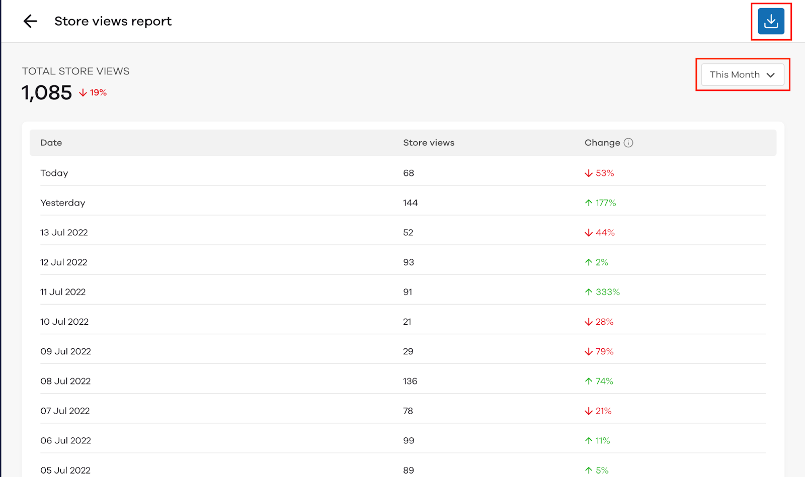
How to download the report?
To download the report, click on the blue download button on the top right corner of the website.
Upon clicking the button, a .csv file will be downloaded into your system.
The analytics dashboard also shows the percentage increase or decrease in;
- Average store views per day
- Returning visitors
- Store views
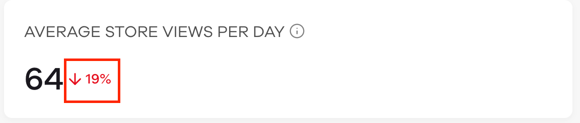
The above image shows that there is a 19% decrease in the average store views per day. If the percentage value is in red with an arrow facing down, it means that the value it is pertaining to has reduced.
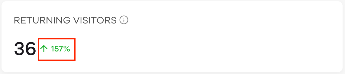
The above image shows that there is a 157% increase in returning customers over the period of time you have selected. In the above image, you can also see that the percentage value is in green with an arrow facing up. Contrary to the above situation, this pertains to the increase in value of the specified category.
How to filter the Analytics (Traffic) data?
The traffic analytics can be filtered by month, date, week, custom range and a lot more. To filter the traffic analytics, click on This Month. After clicking on This Month, the following screen appears.
Here you can choose the desired range based on which you want to filter the data.
Read More: