Mobile devices are becoming increasingly popular for reading emails, so it's crucial to make sure your emails look great on smaller screens. In this guide, we'll show you how to edit your email template to ensure it's mobile-friendly using a drag-and-drop design editor.
Step 1: Create or Open Your Email Template
Begin by either creating a new email template or opening an existing one in your email marketing tool. Once you have your email content ready, follow these steps to make it mobile-friendly.
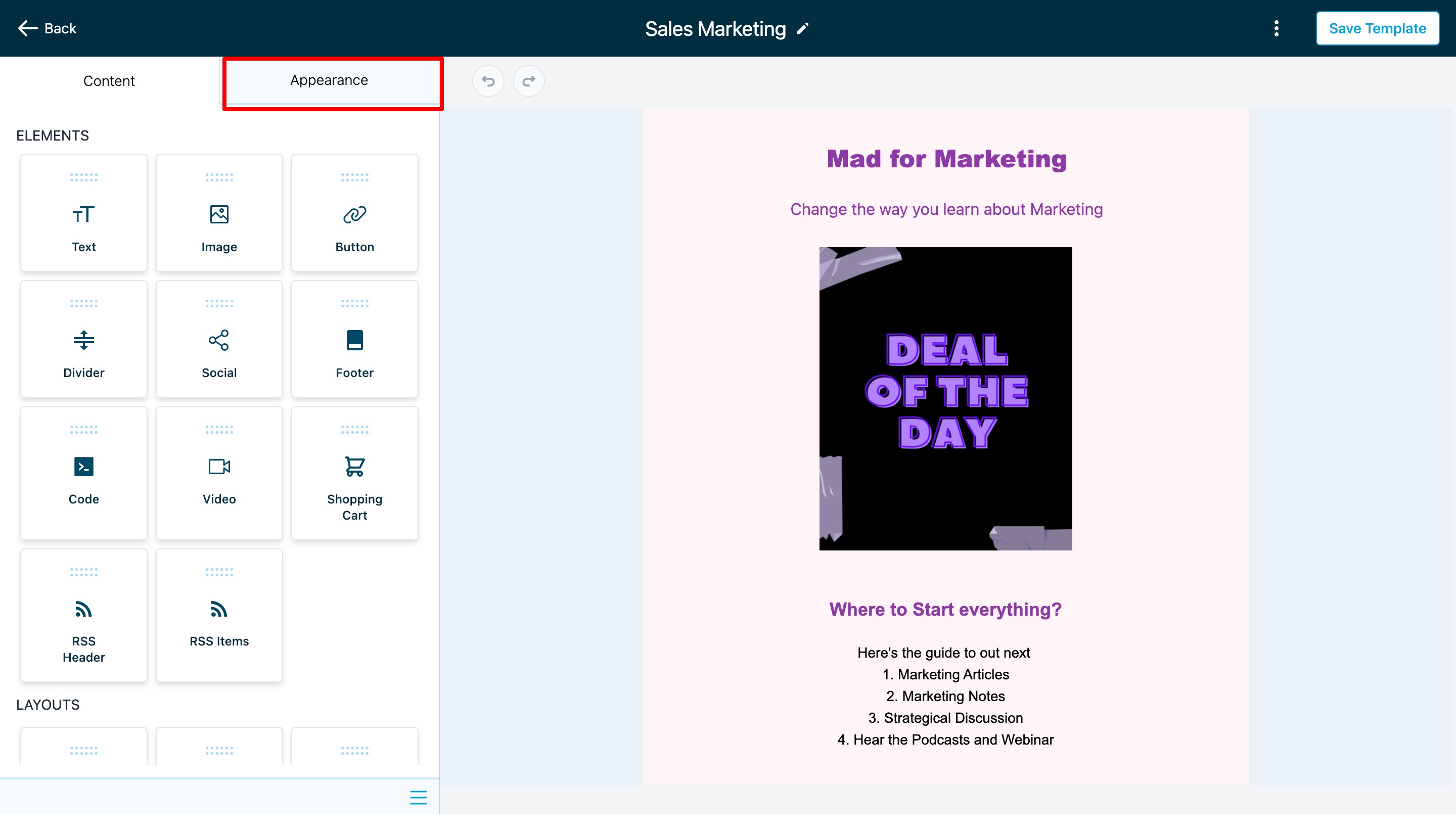
Step 2: Access the "Appearances" Section
Inside your email marketing platform, you'll find an "Appearances" section. This is where you can customize how your email looks, including its appearance on mobile devices.
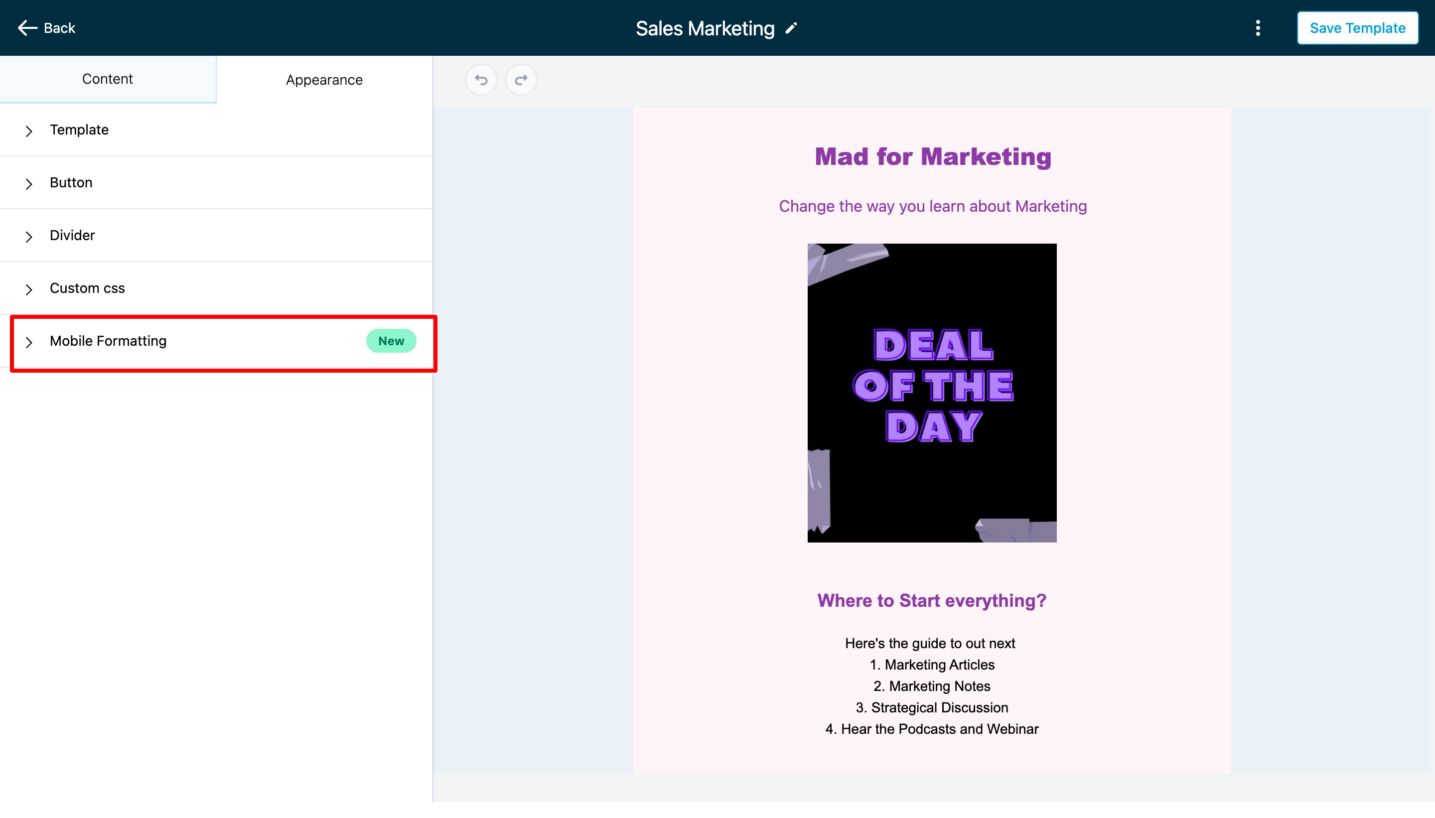
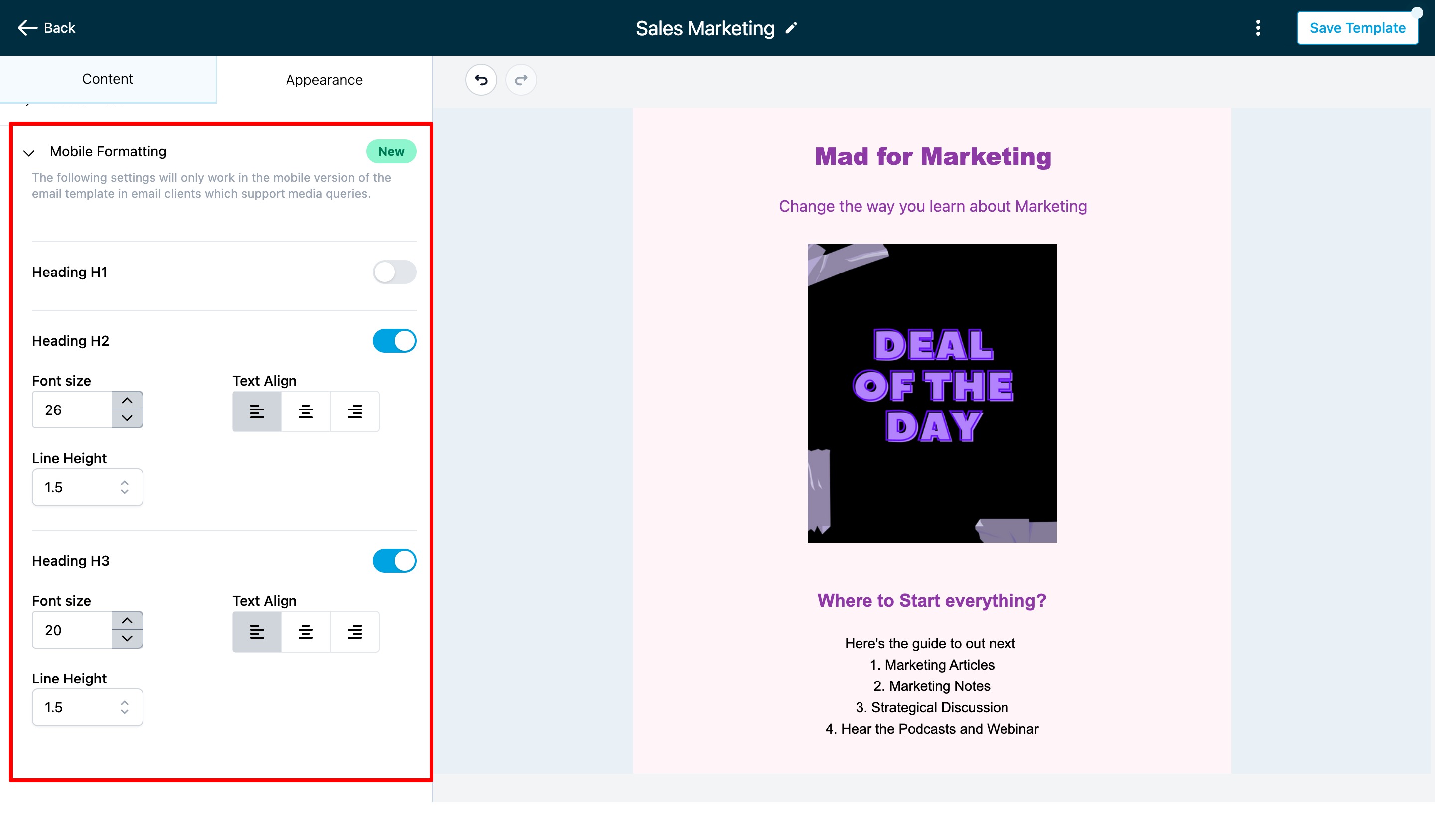
Step 3: Go to "Mobile Formatting"
Look for the "Mobile Formatting" option or tab within the "Appearances" section and click on it. This is where you can tweak the settings specifically for mobile devices.
Step 4: Customize Mobile Styles
Inside the "Mobile Formatting" section, you'll find various options to change the look of your email on mobile screens. You can adjust things like font size, font style, and alignment. Depending on your email platform, you might see different options. For example, you can change the size of the text or the appearance of buttons for mobile devices.
- If you want to make specific changes for mobile, make sure to enable a toggle or switch associated with that option. Turning these on will apply the changes you make for mobile devices.
Note: The changes you make here will only affect how the email looks on mobile devices that support media queries, which are most modern smartphones and tablets.
Step 5: Save Your Changes
Once you've made your desired adjustments for mobile, don't forget to save your changes. This ensures that the changes you made for mobile devices are applied to your email template.
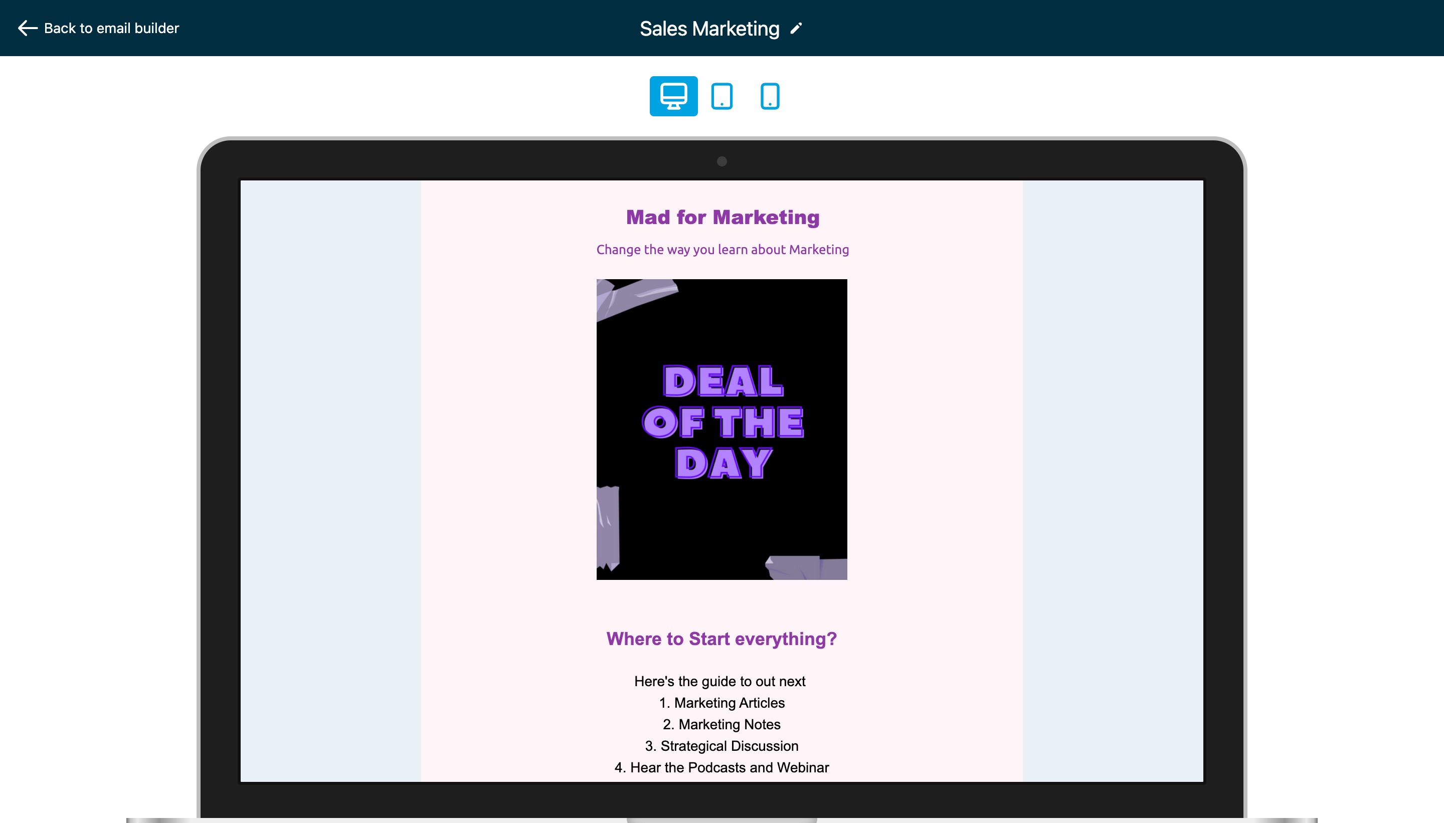
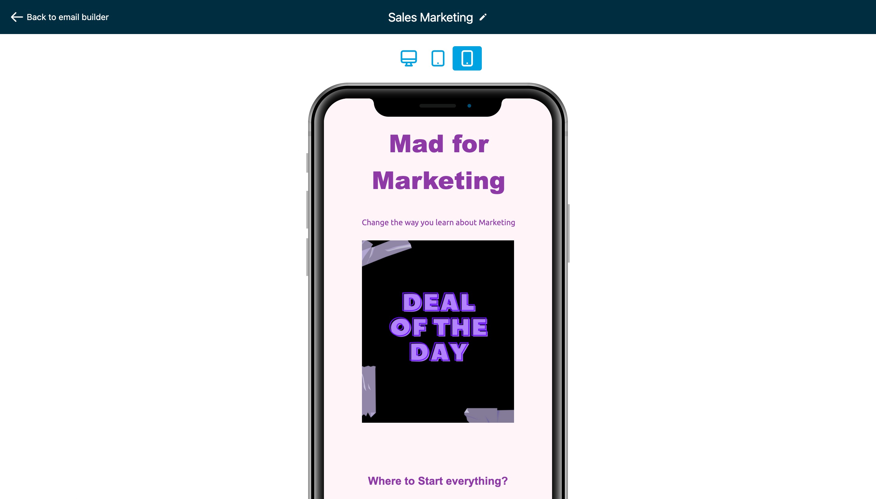
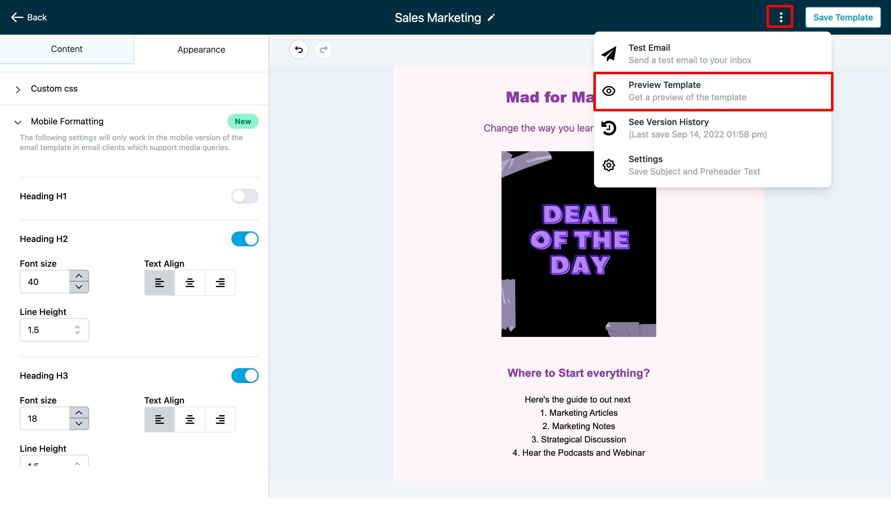
Step 6: Preview in Mobile View
To see how your email will appear on mobile screens, you can preview it. After saving the template with your mobile formatting tweaks, look for an option that lets you view the email in a mobile preview. This might be represented by three dots or an icon indicating a mobile preview.
Step 7: Test on Real Mobile Devices
To be certain that your email looks good and functions properly on mobile devices, it's a good idea to test it on actual smartphones and tablets. Send a test email to yourself or someone you trust and open it on various mobile devices and email apps to ensure everything looks as you intended.