Hiding email elements for mobile and desktop view is a crucial step in optimizing your emails for mobile devices. Here's a step-by-step guide on how to do it:
- Create or Open an Email Template or Campaign: Start by either creating a new email template or opening an existing email campaign that you want to optimize for mobile and desktop views.
- Access the Email Editor: Go to the email editor view where you can make changes to the email's content and layout. Depending on the email marketing platform you're using, this interface may vary.
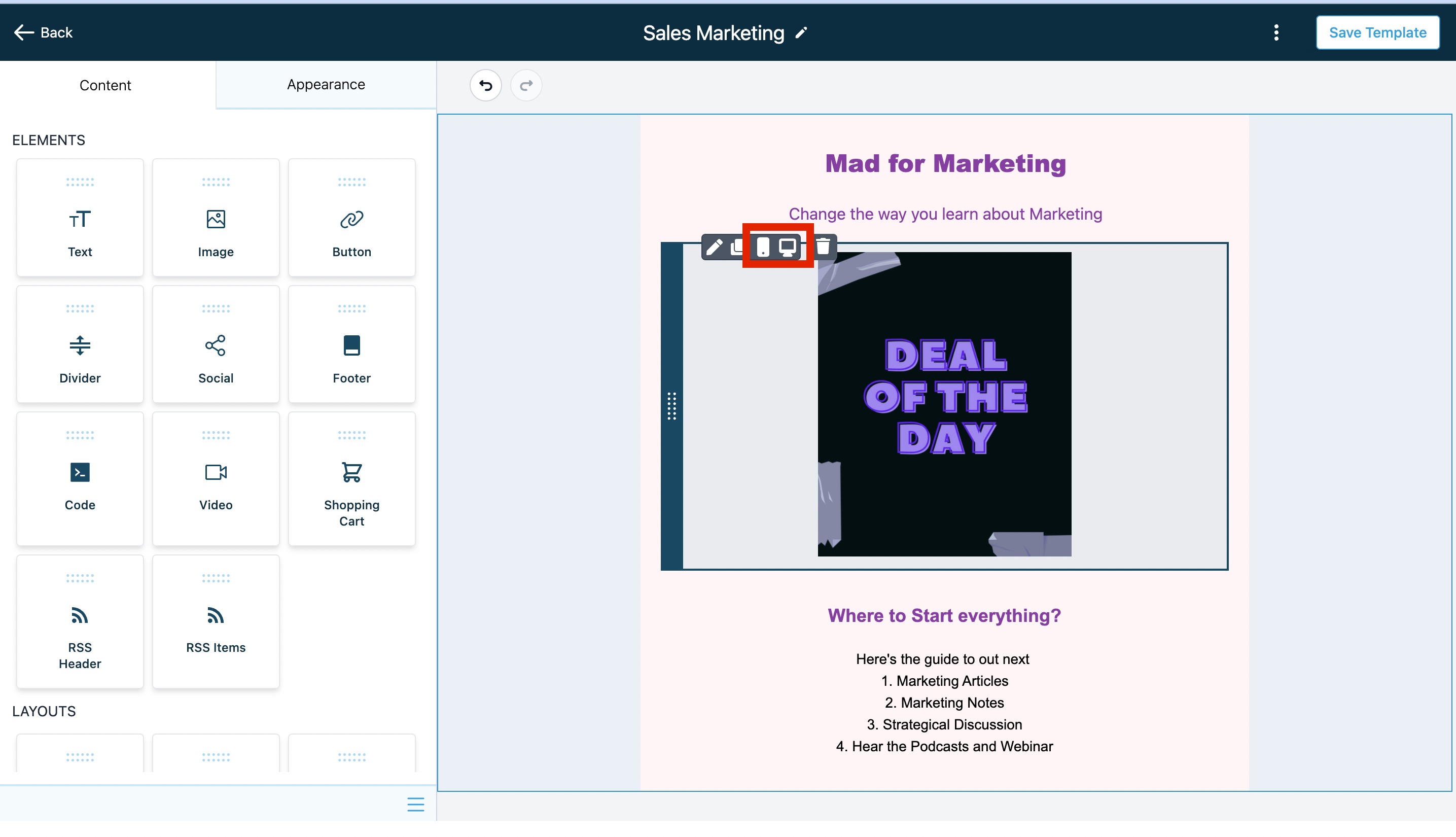
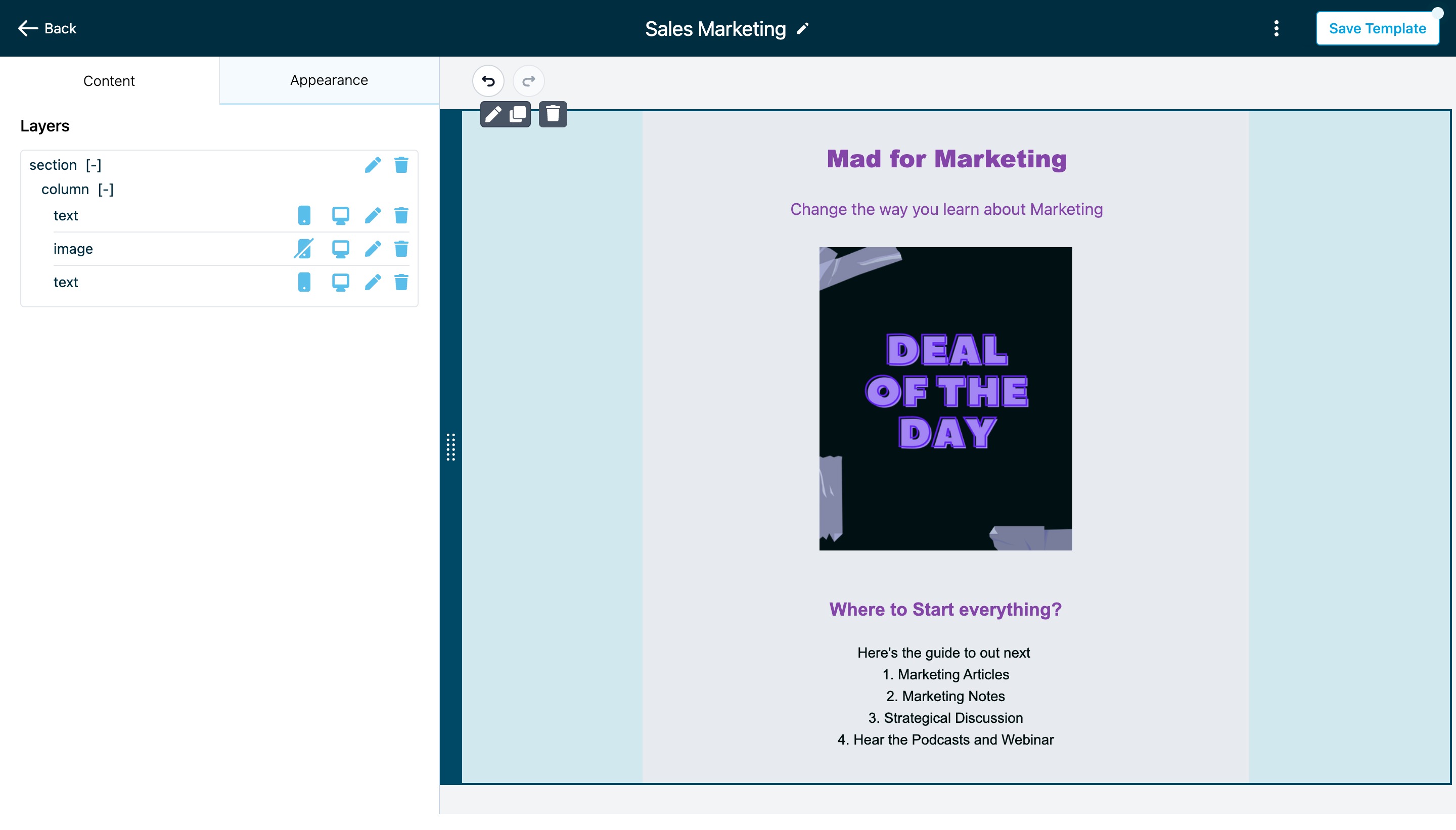
- Edit the Element: Locate the element within your email template or campaign that you want to hide on either mobile or desktop view. This could be an image, text block, button, or any other element.
- Hover Over the Element: Hover your mouse pointer over the element you wish to hide. When you hover, you should see an action menu or options appear.
- Choose to Hide on Mobile or Desktop: Within the action menu, you will typically find options to hide the element specifically on mobile or desktop. Select the appropriate option based on your optimization needs. For example, if you want to hide it on mobile devices, choose "Hide on Mobile."
- Save Changes: After selecting the hide option, make sure to save your changes within the email editor. This will update your email template or campaign with the hidden element settings.
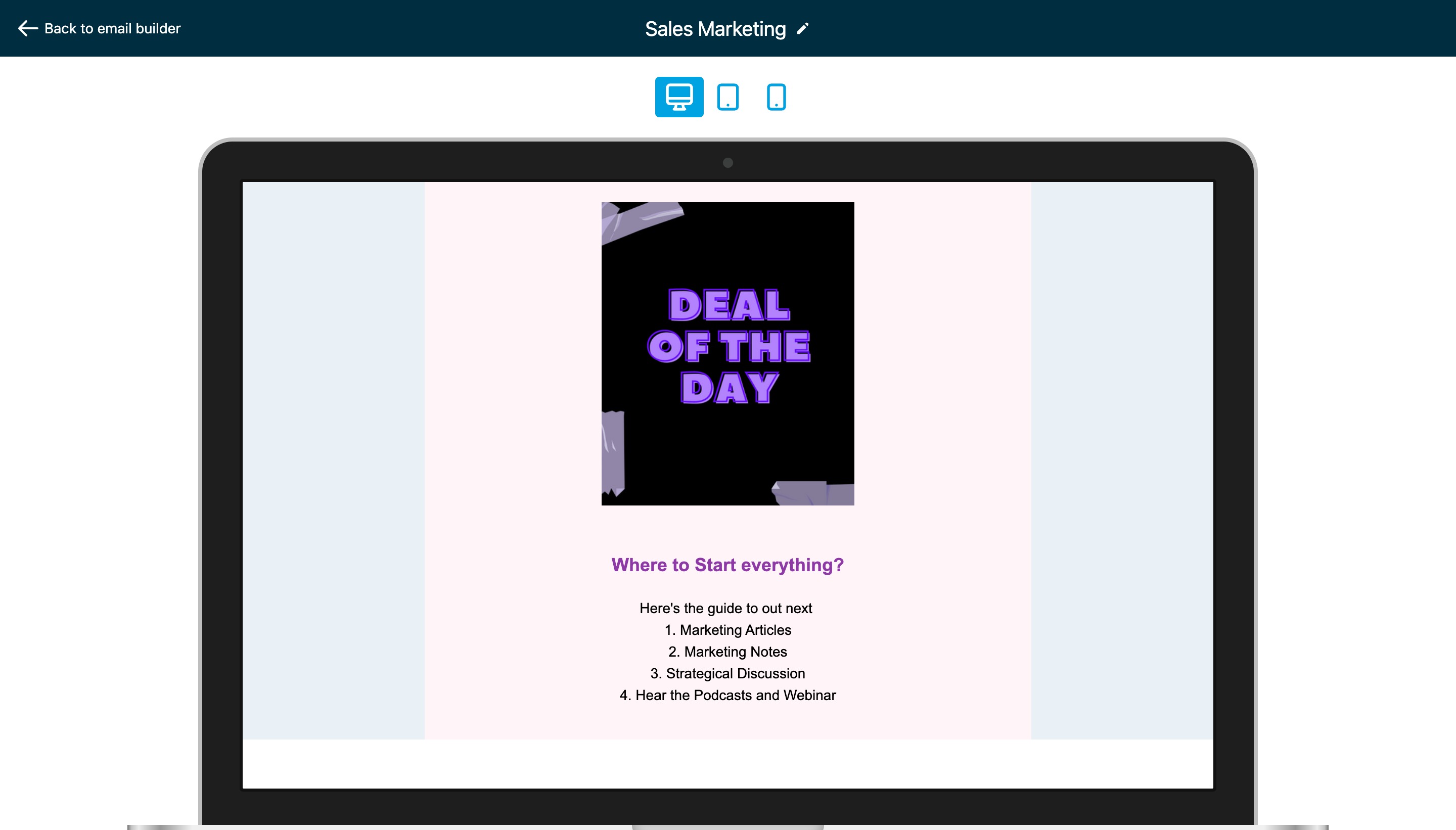
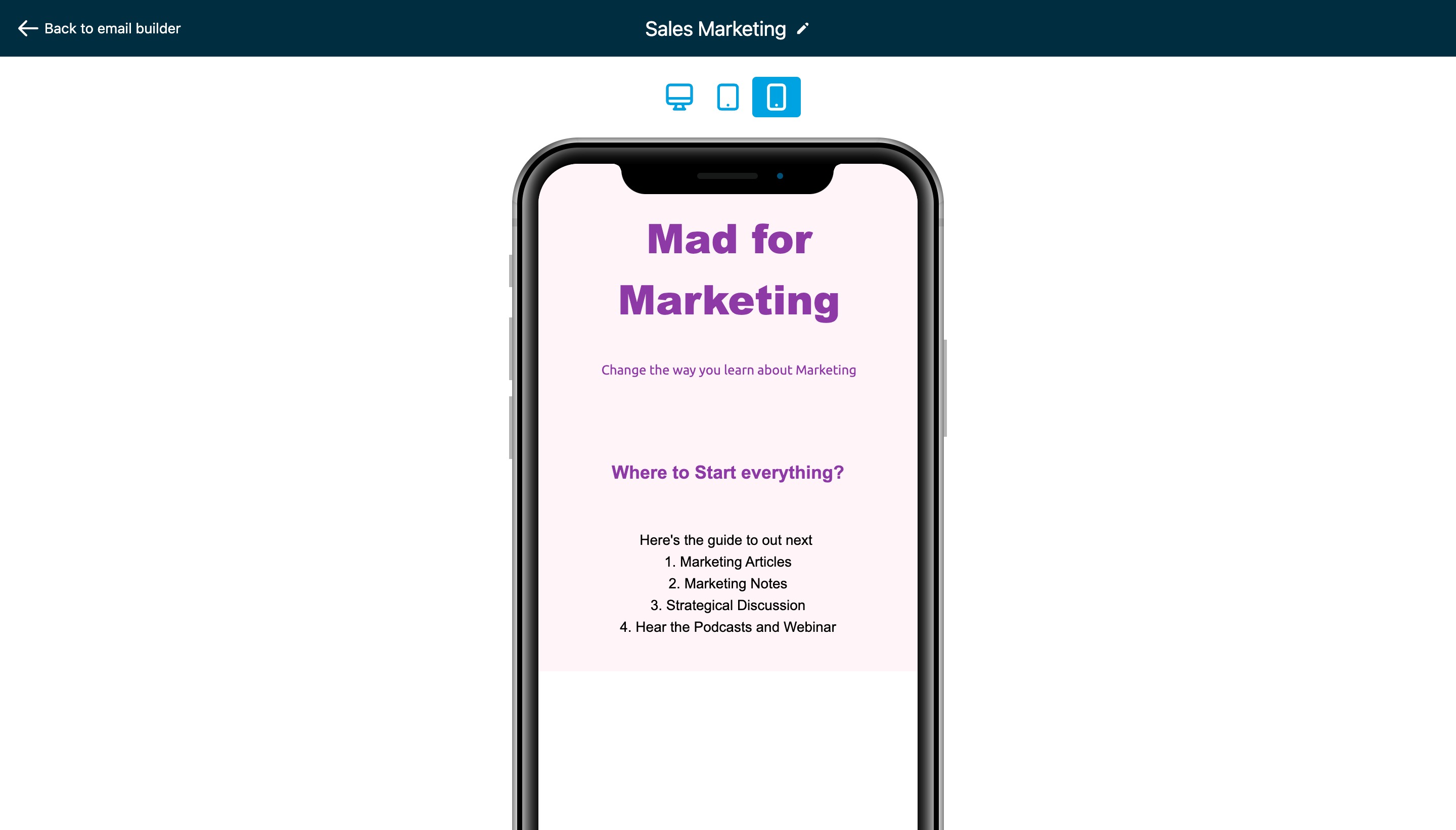
- Preview and Test: It's essential to preview and test your email to ensure it appears as expected on both mobile and desktop devices. Save the email template or campaign, and use the preview function within your email marketing platform to view how it will look on different devices. Additionally, send a test email to yourself or a colleague to check the rendering on various email clients and devices.