Button
Incorporating a button on your webpage is a straightforward task. Begin by selecting the button element and dragging it into the desired location within your editor's workspace. Once in place, you can customize the button's appearance and functionality to align with your design goals and user experience objectives, ensuring seamless integration with the rest of your content.
General Settings
The button setting is a bit complex compared to the previous Elements setting.
Element Name/Title
The editing toolbar for the selected element appears on the left side of the editor, and you can rename the default name or title displayed at the top of the screen for ease of navigation as you create your funnel page.

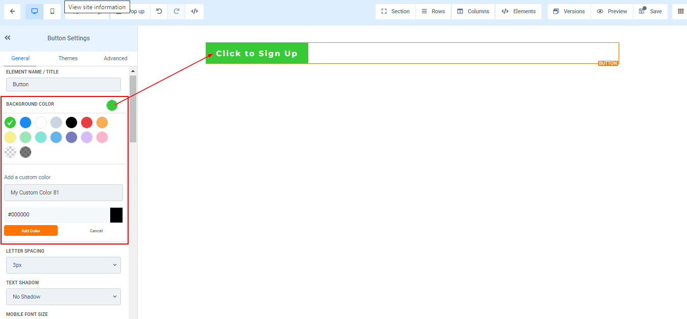
Background Color
To change the background color of your button, select the content you want to modify and choose your preferred color. If you can't find the color you are looking for, input the color code and add custom colors.
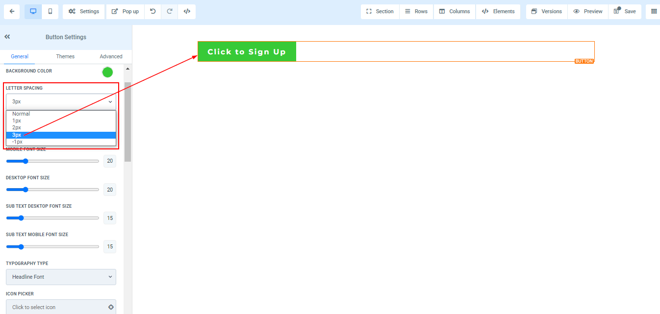
Letter Spacing
You can decide how wide apart you want the letter in your button to be by clicking on this option.
Text Shadow
If you want your text/content to have a shadow, simply select how strong or light you want the shadow to be.

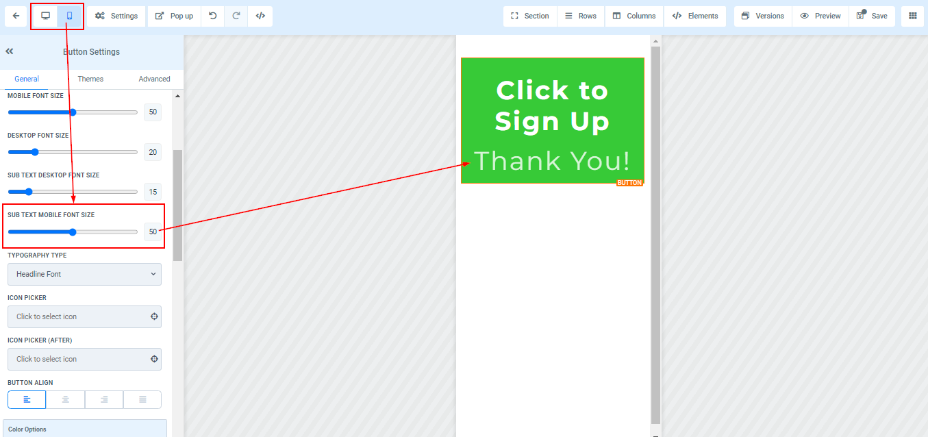
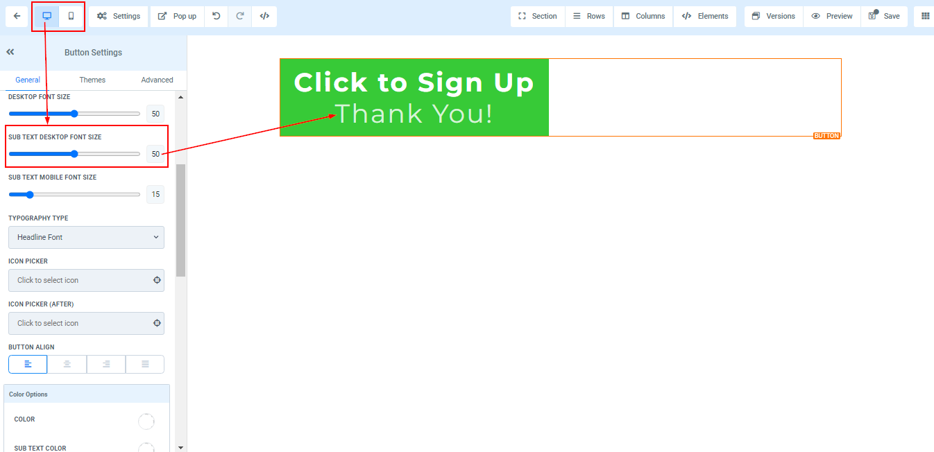
Desktop and Mobile Font Size
You can adjust the mobile and desktop font sizes of the text/content simply by adjusting the size bars.


Sub-Text Desktop and Mobile Font Size
You can adjust the mobile and desktop font sizes of the sub-text/content simply by adjusting the size bars.
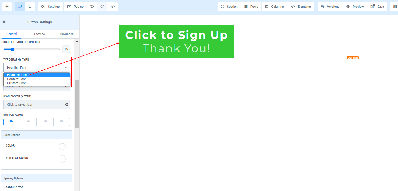
Typography Type
Here you can edit the font of the button text/content. Select the previously chosen button or content font from the settings or choose a new typography font from the drop-down menu.
Icon picker
Add an icon to your button by selecting from the available options or using the search bar to find the specific icon you want. This will place an icon before your text on your button.

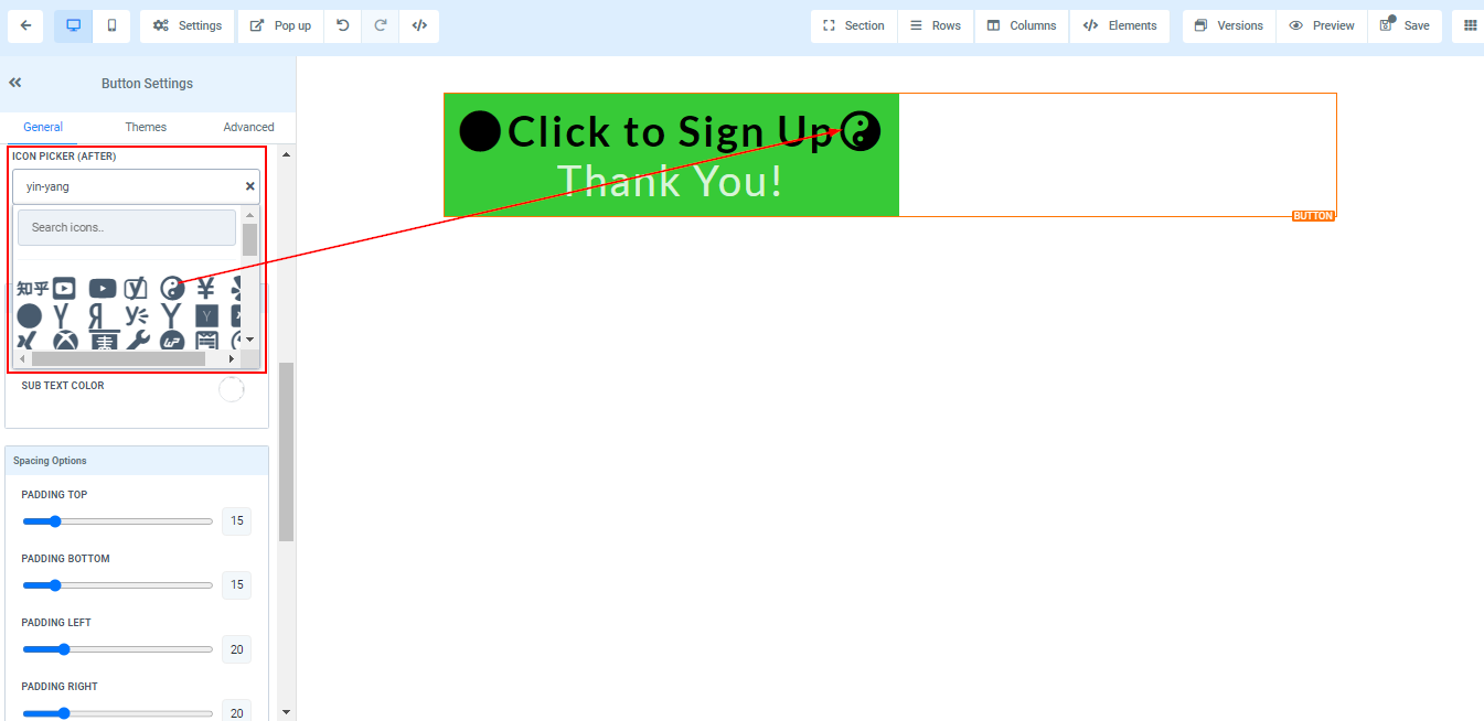
Icon Picker (After)
Here you can add an icon to your buttons. when you add an icon, it's going to position after the text in the button.
Color Options

Color
You can only adjust the text color in the button here, For example, the "Click to Signup" text
Sub-Text Color
When you add a sub-text to your button, you can only adjust the color in the button here.
Spacing Option:
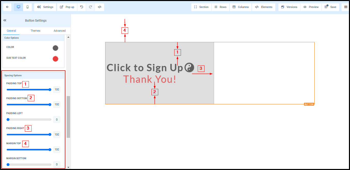
There are different spacing options available for adjusting your button. Depending on the Edit option you are working on, the settings will only be applicable to that option.
- Padding Left, Right, Top, and Bottom
This Four (4) different toggle bar moves the content to either the left, right, top, or bottom depending on the toggle bar you click on.
- Margin Top and Bottom
You can adjust the top or bottom margin of your content by toggling its bars.
Text Options

Text
This is where you can add/edit the text in your button.
Sub Text
If you like to add a subtext to your button, simply type it here.
Button Actions
Link To
You can select from the options where you like to link this particular button to.

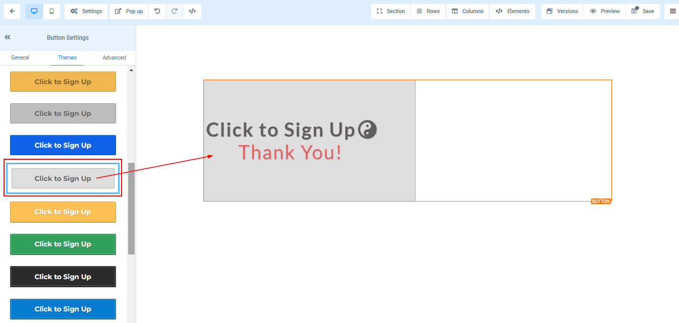
Theme Settings
Choose a theme for your button using the button element. Select the available options under the themes tab at the top right. Note that if you choose a theme here, all previous customizations previously made to the button will be removed.
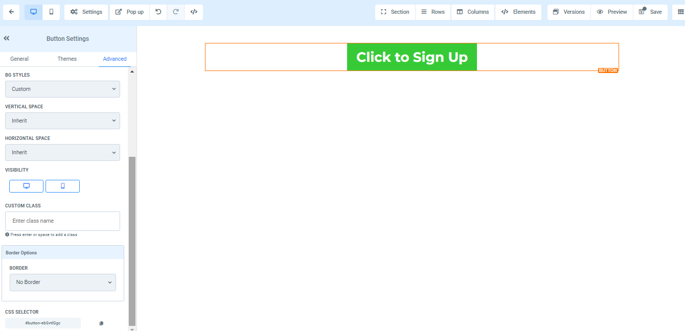
Advanced Settings
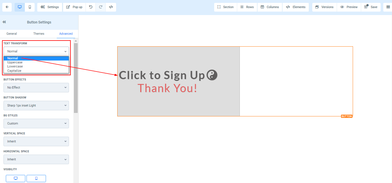
Text Transform
In the Text Transform, you can decide to change the text to Uppercase, Lowercase, or just capitalize each word.
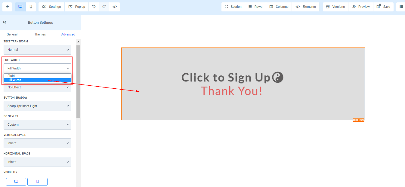
Full Width
You can decide to make the button a full size of the element box or just as fluid.
Button Effect
You can add an effect to your button by simply selecting your choice from the options.

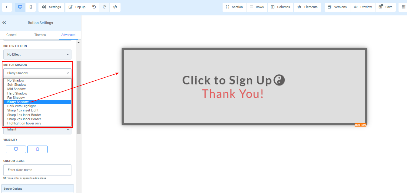
Button Shadow
If you want your button to have a shadow, simply select how strong or light you want the shadow to be.

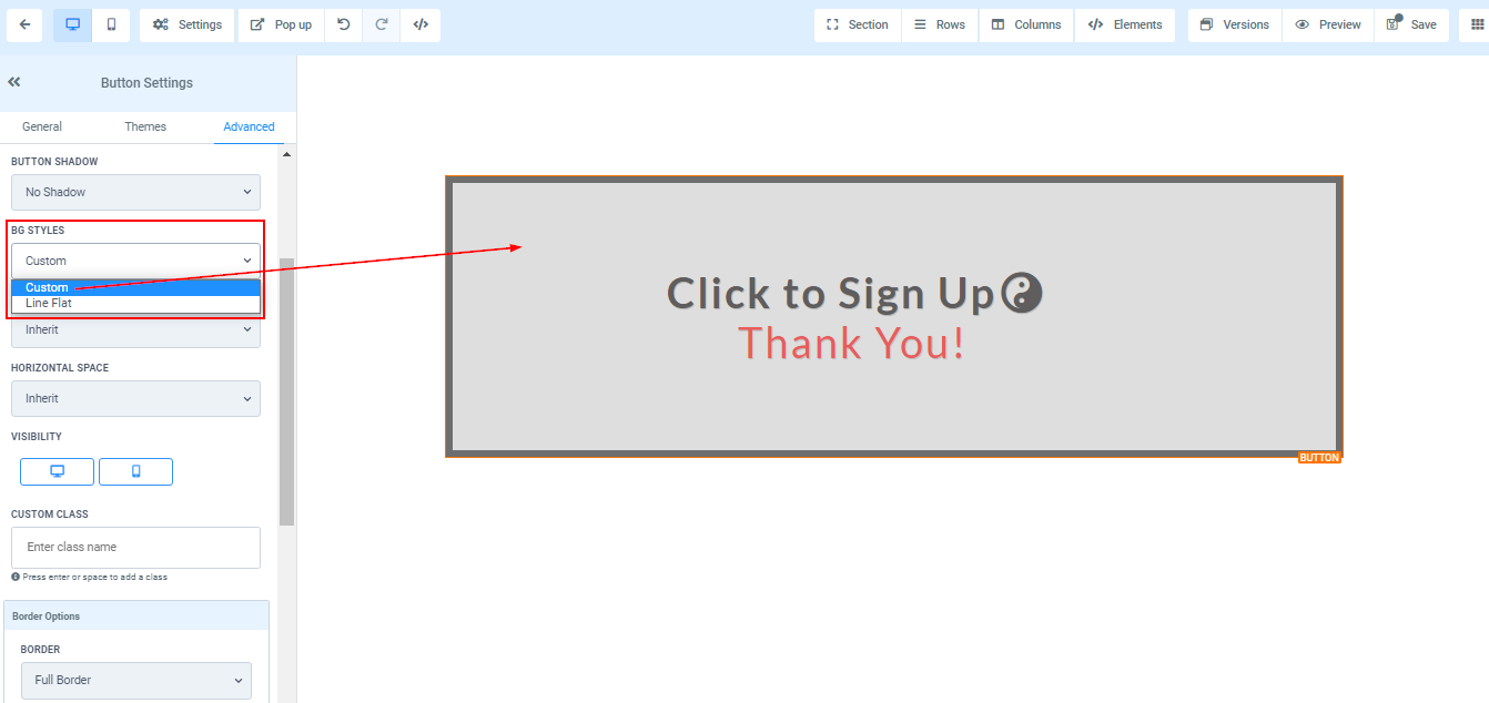
BG Styles
You can decide to keep the background of your button or just remove it so it's just the text that will appear.
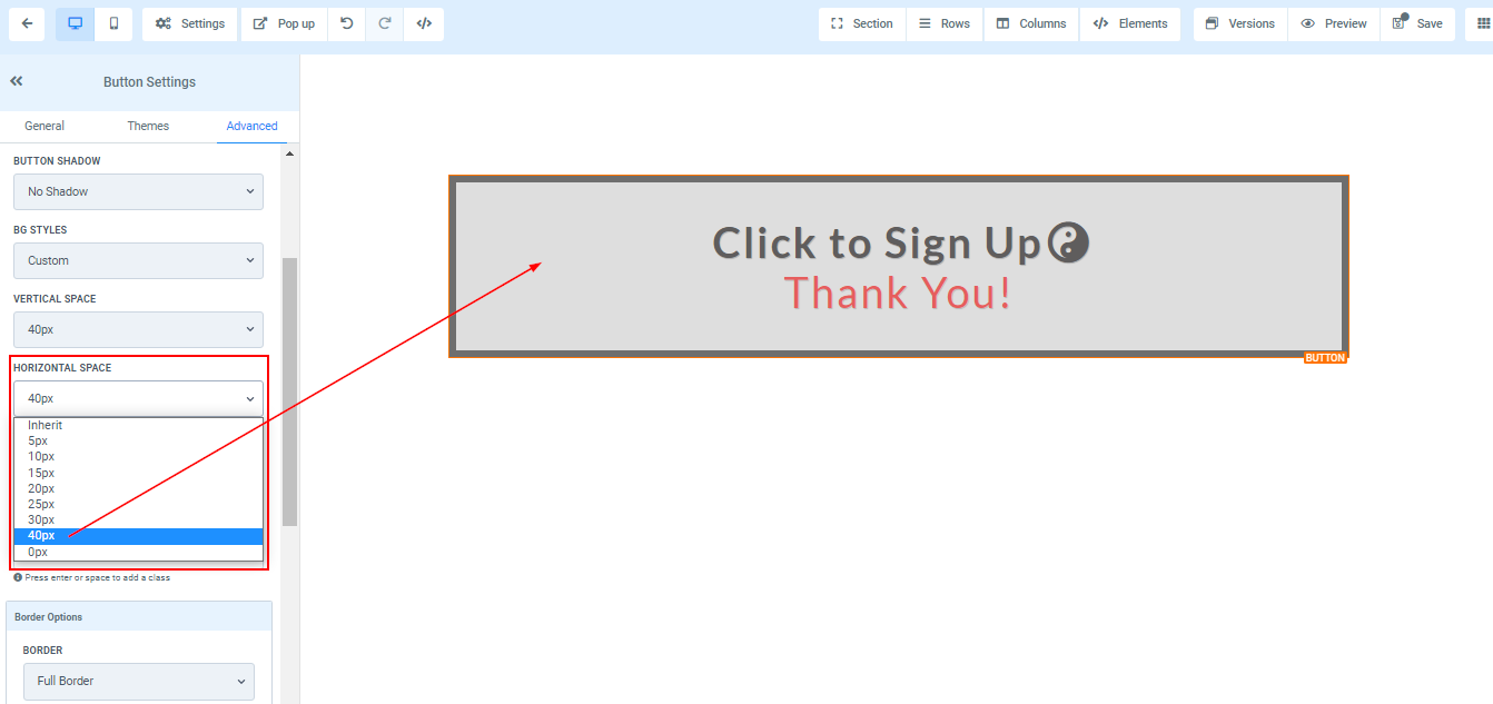
Vertical and Horizontal Spaces
You can increase or decrease the height and width of the button in these spaces.

Visibility
You can make this page visible on both desktop and mobile, and you can also select just one of the two by simply clicking on the one you want to activate.

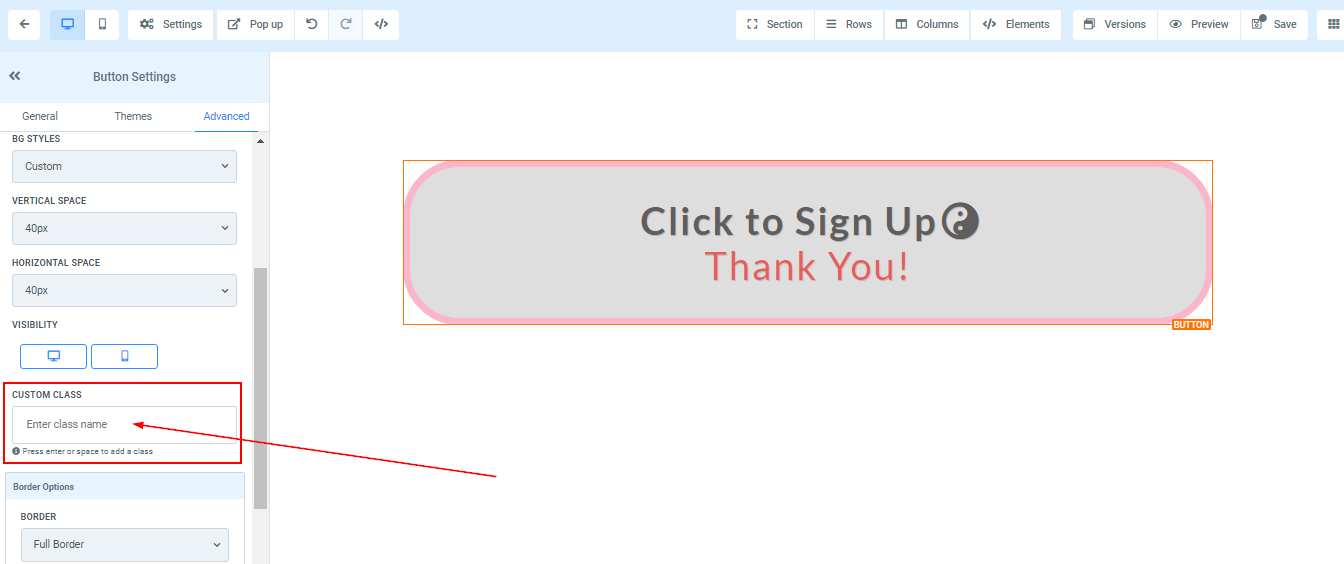
Custom Class
Add a Custom Class by typing a desired class name in the Custom Class field.
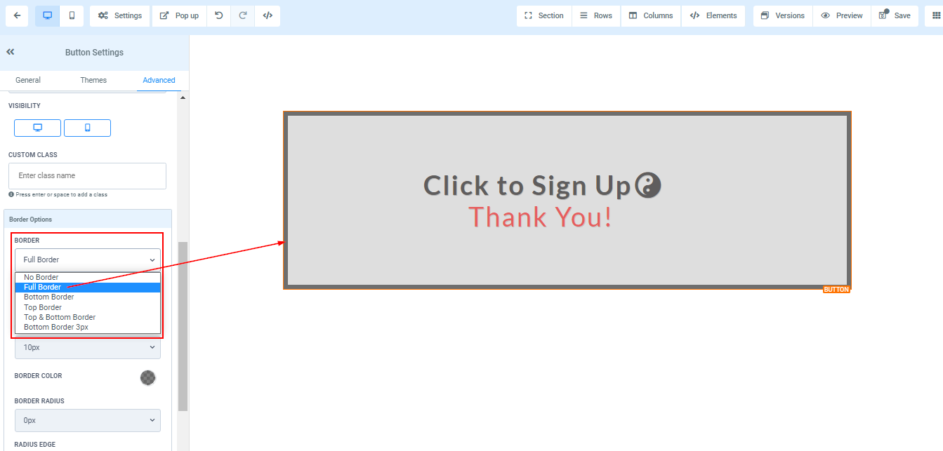
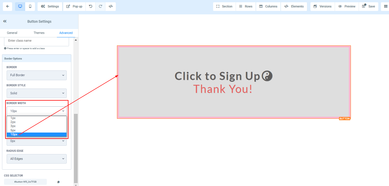
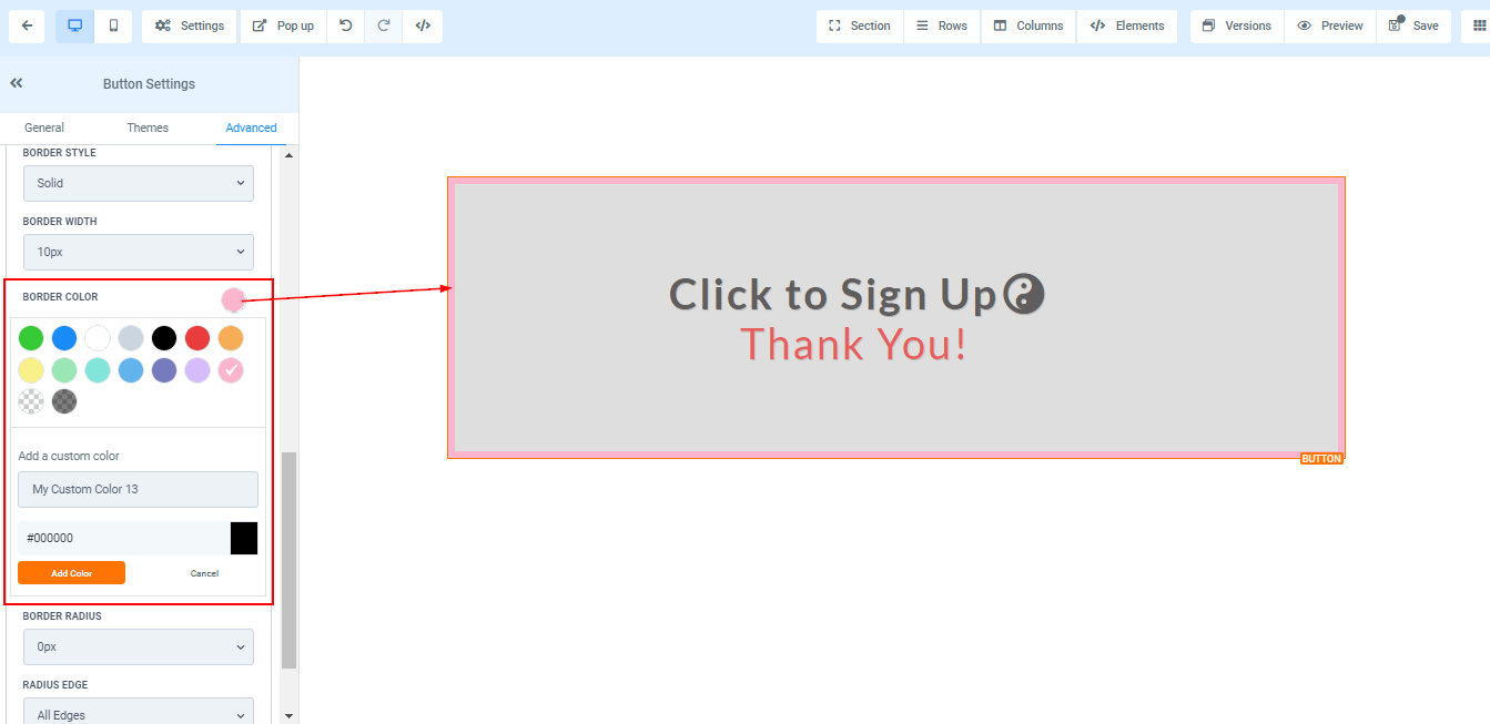
Border Options:
Border You can choose the type of border you want. Once you select any of the border types, the settings for the border pop up;
Style There are three (3) Different styles for your border, It could be a solid, Dashed, or Dotted border.
Width When you increase the border width, it increases the thickness of the border.
Color To change the color of the border, click on this color icon.
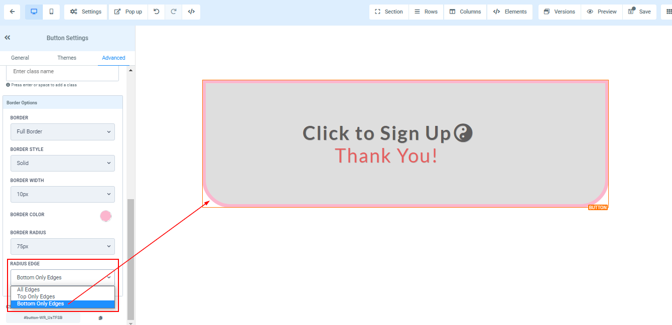
Radius Adjusting the radius of your border curves the edges of the border, the higher the number you select, the curvier it becomes.

Radius Edge You can decide the corner of the border you want to curve, either all edges, Top only or bottom edge only.
CSS Selector
Click the copy icon on the right side of the reference number you want to copy to copy the CSS Selector