By utilizing bullet lists, you can present information in a clear, concise manner that effectively engages your audience and elevates the overall user experience.
General Settings
Incorporating bullet lists into your page is a simple and intuitive task. Begin by selecting the bullet list element and dragging it to your editor's workspace, where you can customize it according to your preferences. Once the element is in place, an editing toolbar tailored specifically for the selected element will appear on the left side of the editor.
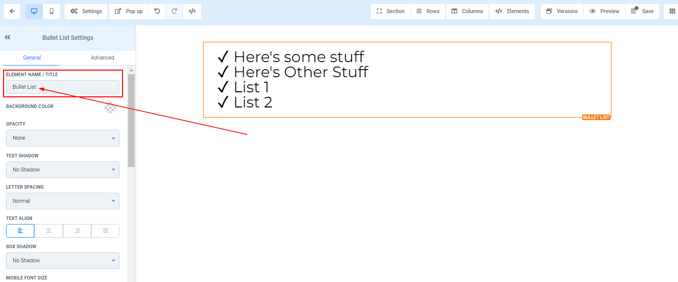
Element Name/Title
To improve navigation and streamline your workflow, you have the option to modify the default name or title that appears at the top of the screen while crafting your funnel page. By renaming the default title, you can ensure that each step in your funnel is easily identifiable, making it simpler to navigate between different stages of the process.
Background Color
To change the background color of your bullet list, select the content you want to modify and choose your preferred color. If you can't find the color you want, input the color code and click the "add color" button to include custom colors.

Opacity
Enhance the visual appeal of your element box text or content by adjusting its opacity level to create a fade effect. With the opacity option, you have the flexibility to choose from various levels of fade, ranging from None (fully opaque) to Light, Half, and Heavy Fade (increasing levels of transparency). This feature allows you to customize the appearance of your content, adding depth and visual interest to your page.

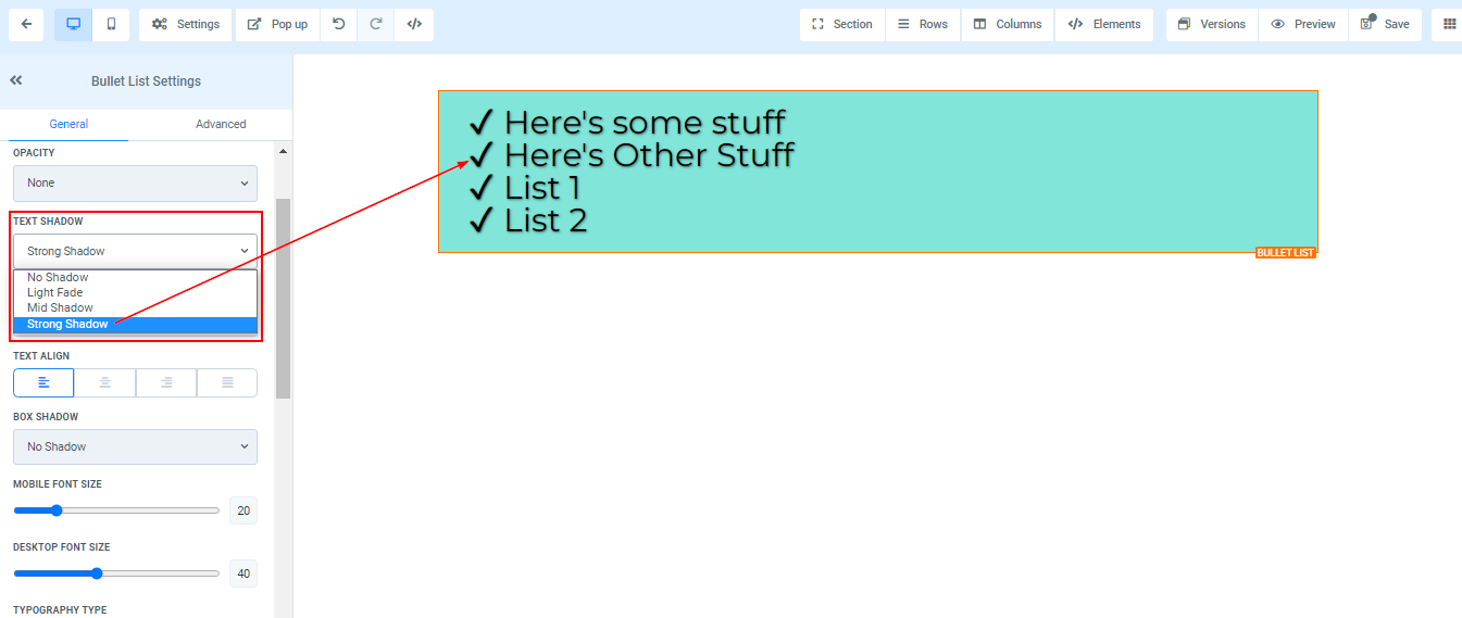
Text Shadow
To elevate the visual appeal of your text or content, consider utilizing the shadow thickness option to incorporate a shadow effect. This feature allows you to add depth and dimension to your content, making it more engaging and visually striking for your audience. By adjusting the shadow thickness, you can create subtle or bold shadow effects that enhance the overall design and aesthetic of your website.
Letter Spacing
In addition, you have the ability to refine the appearance of your text by adjusting the letter spacing option, which controls the space between individual letters. This feature provides you with the flexibility to fine-tune your content's readability and visual appeal, ensuring an optimal user experience for your audience

Text Align
The text align option provides you with the flexibility to arrange your text according to your desired alignment, be it left, center, right, or justified. This feature enables you to tailor the presentation of your content to suit your preferences and enhance the overall visual appeal of your website.

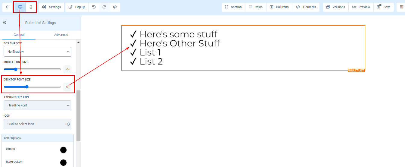
Mobile and Desktop Font Size
You can modify the font size of mobile and desktop devices by using the size bars for each individual text or content element. View your edits for each platform by toggling between mobile and desktop views in the top left corner of your funnel builder.

Typography Type
You have the option to modify the typography font of your text, allowing you to either utilize the headline or content font that you've previously chosen for your funnel/website, or select a custom font from the available dropdown menu.

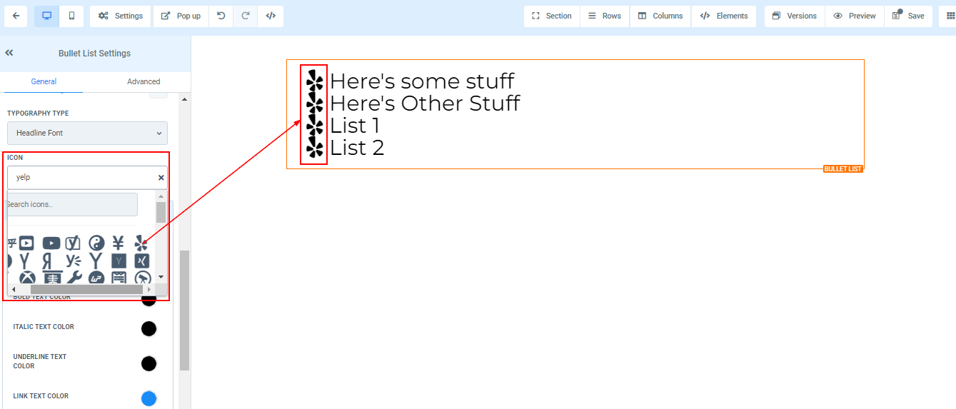
Icon
Incorporating an icon into your webpage can be easily achieved by browsing through the available options or utilizing the search bar to pinpoint the exact icon you desire. This feature offers you a wide range of icons to choose from, allowing you to enhance the visual appeal and functionality of your content.
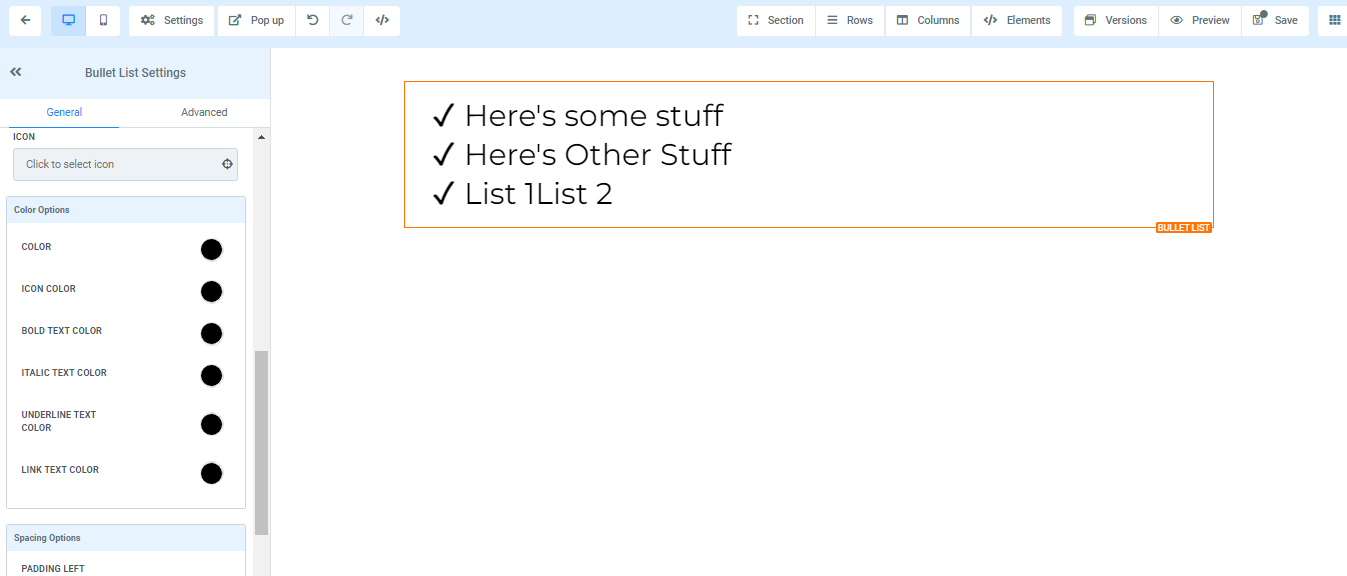
Color Options
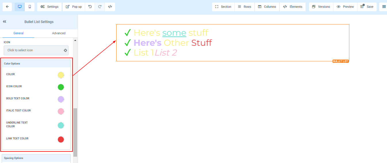
- Color When a text isn't in bold form, you can only adjust its colors here
- Bold Text Color If a text is in bold form, you can only adjust its colors here.
- Italic Text Color You can only edit an italic text color here
- Underline Text Color You can only edit an underlined text color here
- Link Text Color If you have a link added to this page, you can only edit the link color here
- Icon Color If you have an icon added to this page, you can only edit the icon color here. Only the icon color will change regardless of the position it's placed.
Spacing Option:
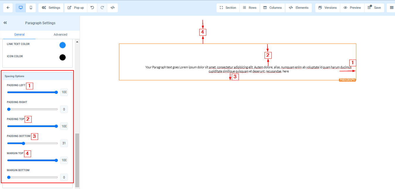
There are different spacing options available for adjusting your content. Depending on the Edit option you are working on, the settings will only be applicable to that option. For example, if you are editing a particular Row (the BLUE box), only every content in that Row will follow the command of what settings you make.
- Padding Left, Right, Top, and Bottom
- This Four (4) different toggle bar moves the content to either the left, right, top, or bottom depending on the toggle bar you click on.
- Margin Top and Bottom
- You can adjust the top or bottom margin of your content by toggling its bars.
Advanced Settings
Border Options:
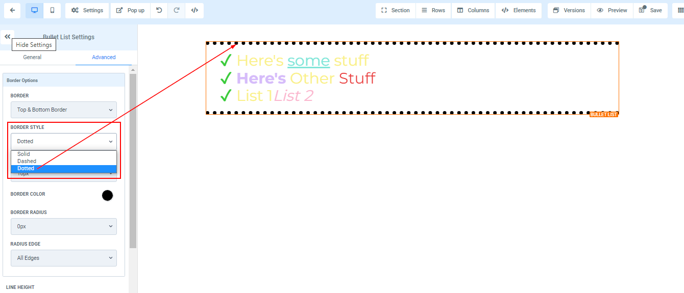
Border You can choose the type of border you want. Once you select any of the border types, the settings for the border pop up;
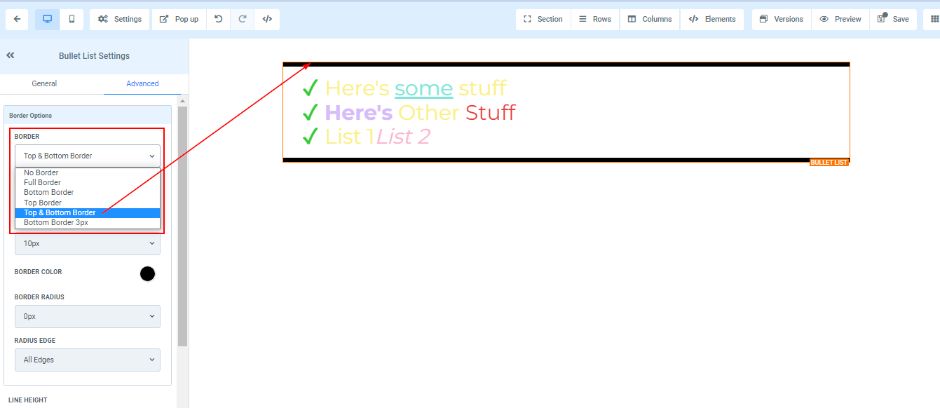
Style There are three (3) Different styles for your border, It could be a solid, Dashed, or Dotted border.
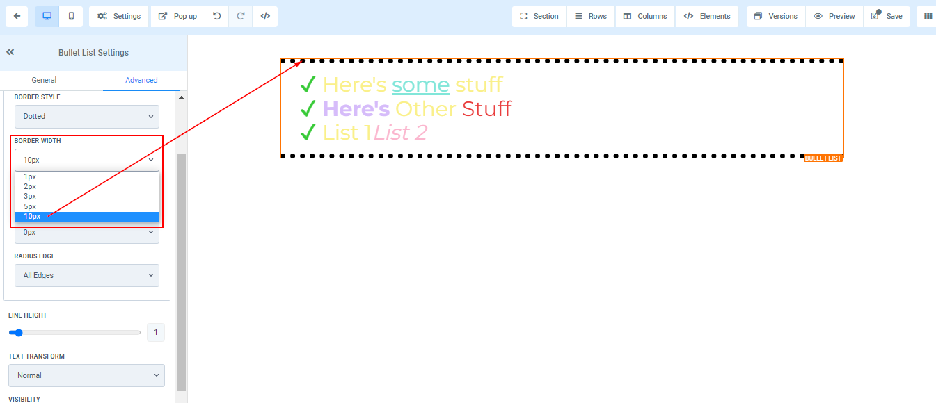
Width When you increase the border width, it increases the thickness of the border.
Color To change the color of the border, click on this color icon. Choose a color, or add a custom color by typing the code into the given field.

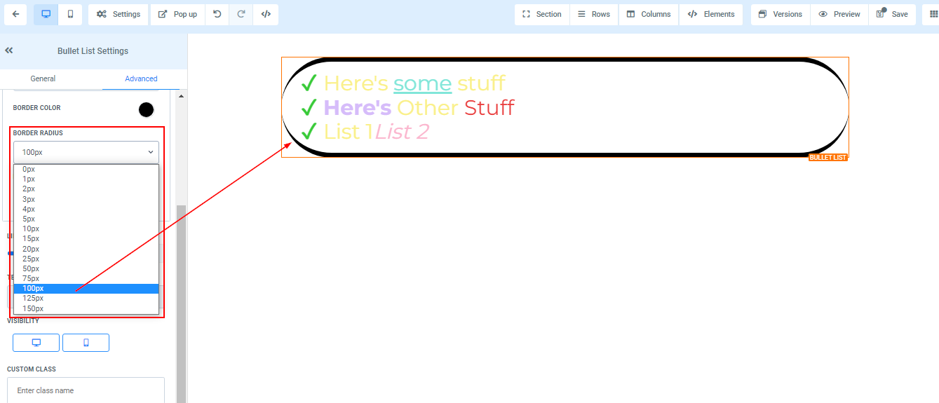
Radius Adjusting the radius of your border curves the edges of the border, the higher the number you select, the curvier it becomes.
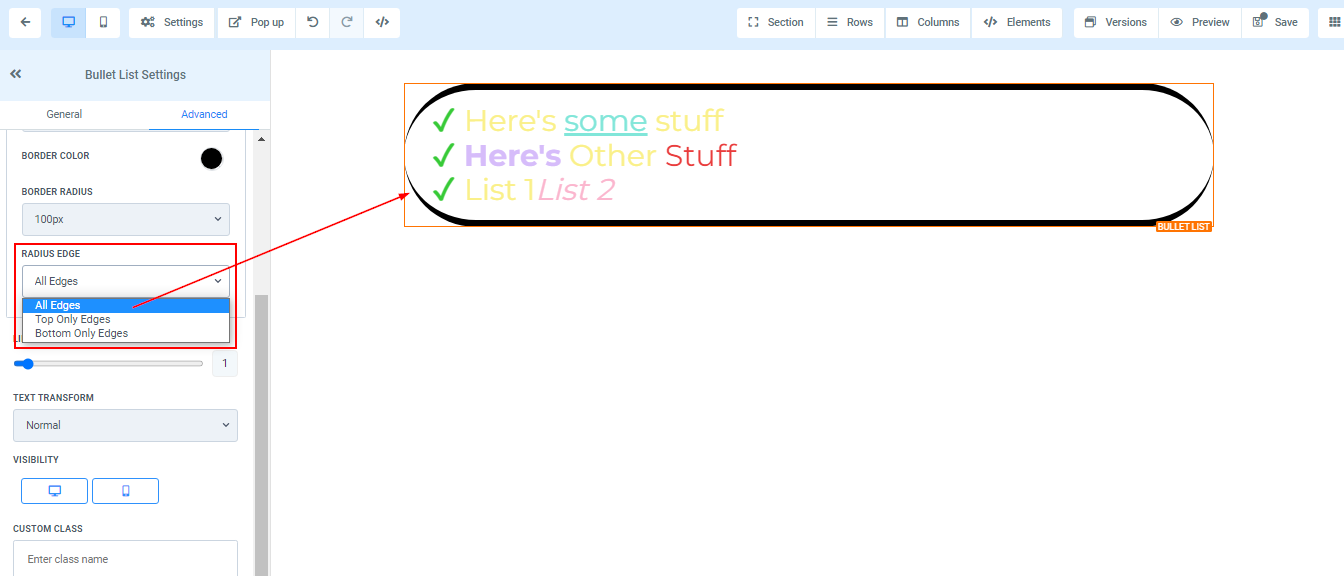
Radius Edge You can decide the corner of the border you want to curve, either all edges, Top only or bottom edge only.
Line Height
The Line Height option empowers you to modify the height of the Element box by simply dragging the size bar, allowing you to either expand or condense its dimensions as needed.

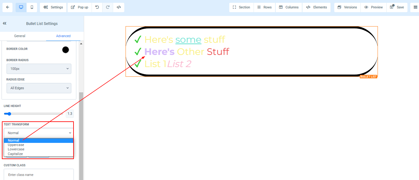
Text Transform
The Text Transform feature allows you to effortlessly alter your text by converting it into uppercase, lowercase, or capitalizing each word. This versatile tool provides you with the flexibility to customize the appearance of your content, ensuring a visually appealing and engaging experience for your audience.
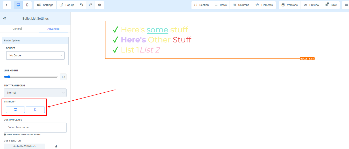
Visibility
Control the visibility of your page on desktop, mobile, or both by selecting the respective options under the Visibility feature. You can hide elements from the desktop or mobile view to customize user experience.
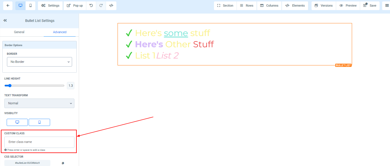
Custom Class
In order to incorporate a Custom Class into your design, simply enter the preferred class name into the designated Custom Class field. This feature allows you to personalize your content by applying custom styles and attributes.
CSS Selector
To duplicate the CSS Selector of a specific reference number, simply locate the copy icon situated on the right side of the desired reference number and click on it. This action enables you to effortlessly copy the corresponding CSS Selector, which then can be used in another website.