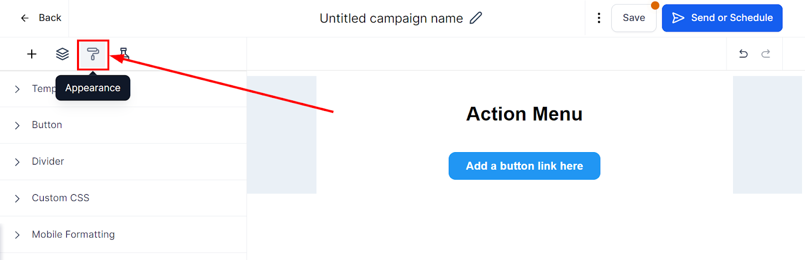
Edit Appearance
The appearance tab within the email builder provides access to global level settings that apply to all your emails by default. These settings include template settings, buttons, dividers, and custom CSS. Understanding these settings is essential to help you create a consistent design across all your emails.
You can use the settings to customize your email template's appearance, add buttons, dividers and craft custom CSS. By utilizing these features, you can create a professional-looking email template that aligns with your brand's identity and style.
Template
Within the email builder, you can access the Template Details section to control three aspects - background color, body color, and content width.
- Background Color - Choose and customize your emails in your own brand colors or just to make them stand out, you can set default colors here.
- Body Color - Change and customize the color of your email body here.
- Content Width - You can increase or decrease the content width of your emails here.
- Background Image - You can add an image to use as the background here.

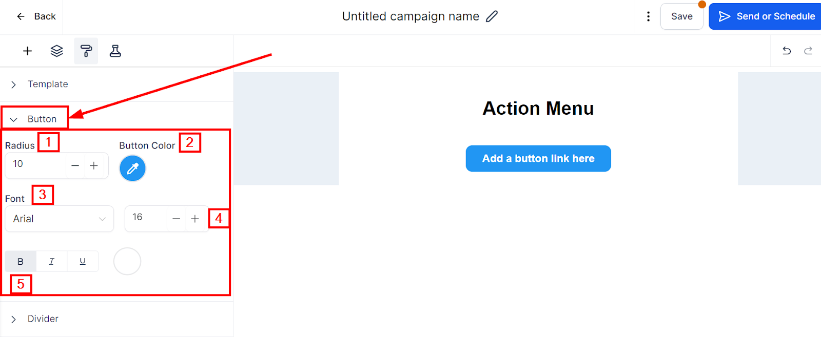
Button
The Button section provides controls to customize the buttons in your emails, typically used as a Call to Action.
- Radius - Adjust the size of your buttons, making them either bigger or smaller, depending on your email layout.
- Button Color - Select your brand colors or colors that align with your brand's identity to create buttons that effectively stand out.
- Fonts - Choose from a range of font types and add formatting such as bold, italics, and underlines to your buttons
- Font Size - Choose a font size that goes well with your button size or vice versa to achieve a balanced and aesthetically pleasing design.
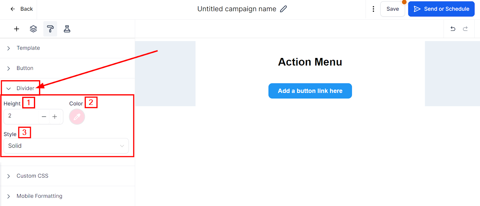
Divider
Dividers make elements in your email template stand out and add visual appeal by breaking up content sections. Within the Dividers settings, you can further control the look and feel of dividers in your email template.
The control options within the divider settings are:
- Height - Adjust the height of your dividers, making them either thicker or thinner to suit your email design.
- Color - Select the colors you want your dividers to be in, either matching your brand colors or standing out with a contrasting color.
- Style: You can choose between Solid, Dotted, and Dashed in the Style section. Selecting the right style helps you achieve the look and feel you desire for your email template.
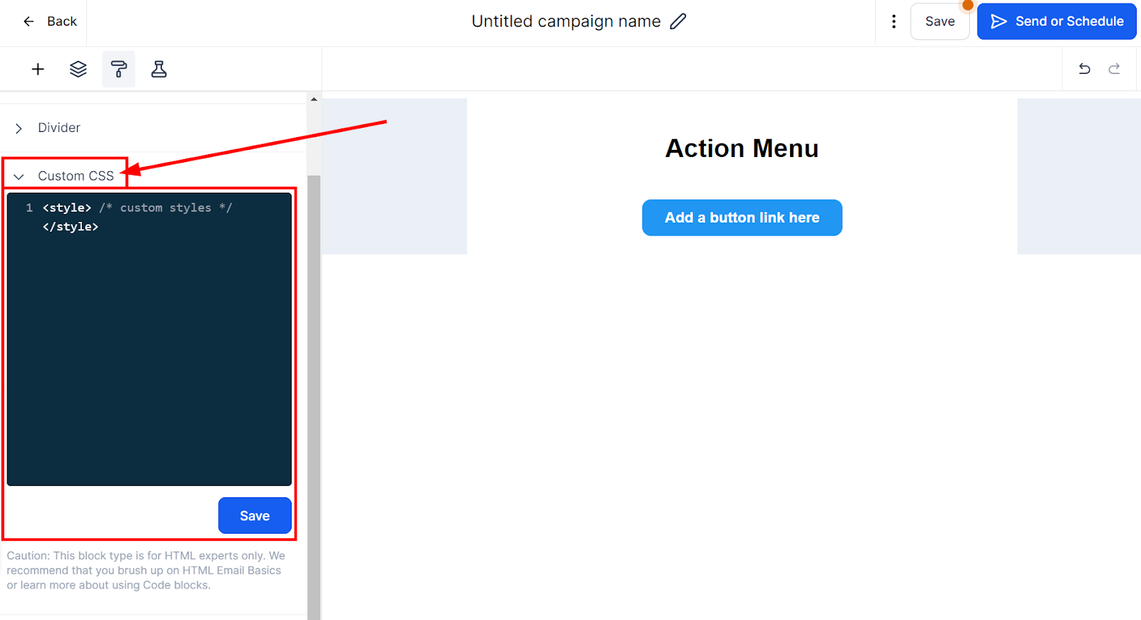
Custom CSS
If you're an HTML expert and want an extra level of customization for your email template, you can use the Code block type. This option allows you to write your own custom code to achieve the desired email design.
However, we recommend that you exercise caution when using this feature since it is intended for those with HTML expertise. If you're unsure about how to use this feature, we recommend brushing up on HTML Email Basics or learning more about Code blocks. Use this feature to create complex email designs and push the boundaries of your email design capabilities.
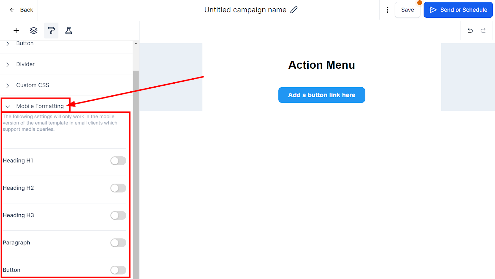
Mobile Formatting
The following settings will only work in the mobile version of the email template in email clients which support media queries.
In Mobile Formatting, there are options for different styles, font heights, and alignment. For font size or button style, the toggle needs to be enabled to apply for mobile formatting.
Once the settings are implemented for mobile, click the three dots after saving the template for preview in the mobile view.