1-Step Order Form
Using this element is a great way to obtain shipping details regarding your customer, along with other useful information. You'll find that for 1-Step Order Form there are two elements combined in one form – the Shipping details and pertinent information! Now you don't have to take the time to get each detail separately. It has never been easier for businesses to collect all the facts and figures with just one swift process than it is now!
General Settings
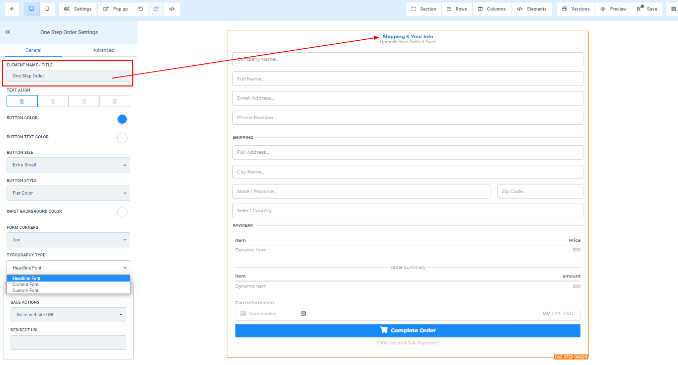
Element Name/Title
Under the General Settings feature, you can view the default name or title of the editing option you are currently working on, which is displayed under Element Name/Title. Furthermore, you have the option to keep the default title or rename it according to your preferences.
Text Align
Additionally, under the Text Align option, you can adjust the position of your text, either left, center, right, or justify it.

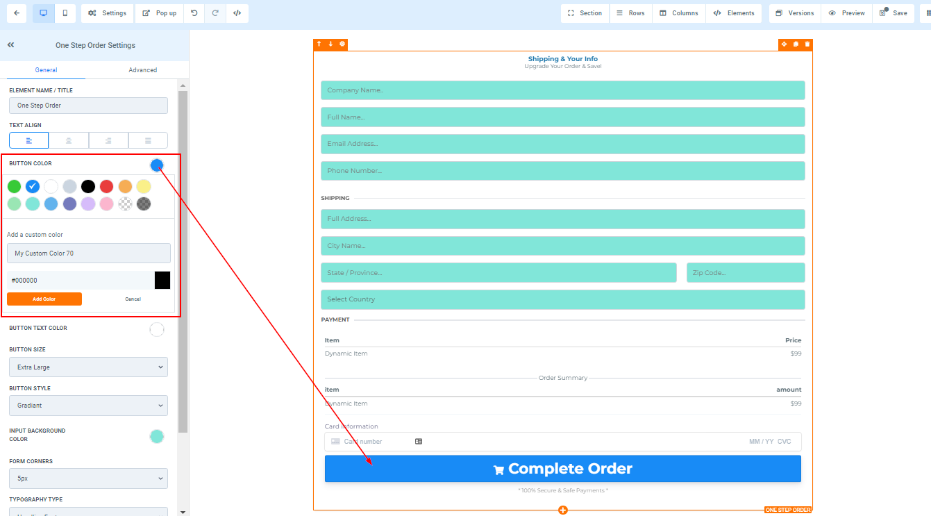
Button Color
To customize the button color of your order form, simply click on the desired color from the available options.
In case the desired color is not available, you can add a custom color by typing its code in the designated field and clicking Add Color.
Button Text Color
Similarly, under Button Text Color, you can customize the color of the text displayed on your order form button by selecting the desired color option.
If you cannot find the color of your choice, you can add a custom color by entering its code in the provided space and clicking add color.

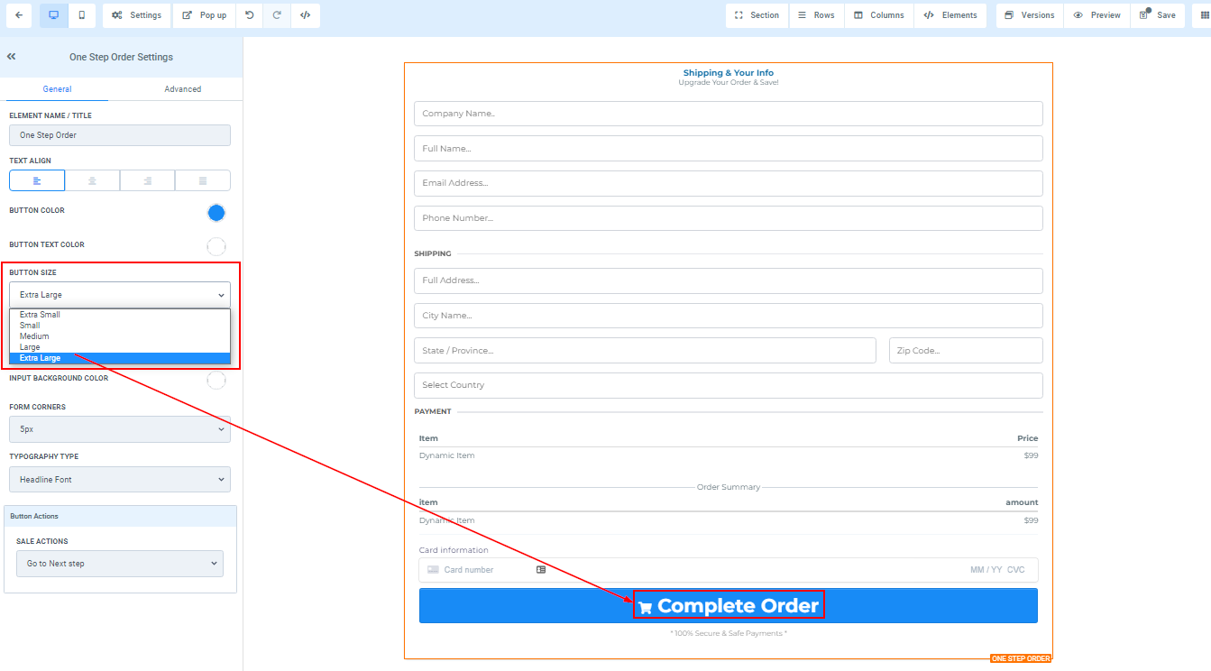
Button Size
Under Button Size, you can adjust the size of your button according to your preference. You can choose from Extra Small to Extra Large sizes.
Button Style
For Button Style, you can select a style for your button by choosing from the available options.

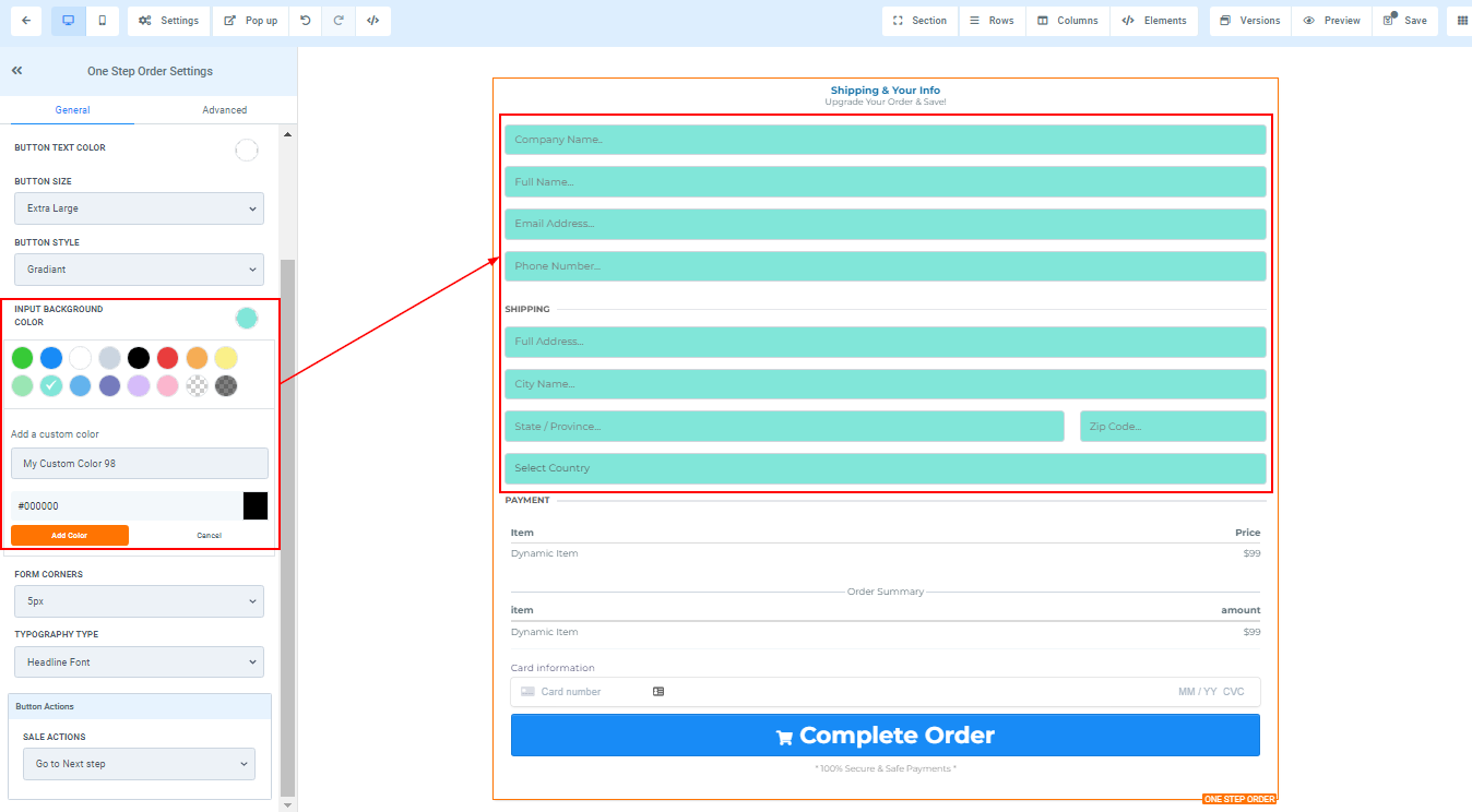
Input Background Color
Under the Order Form Customization feature, you can add a background color to your order form input by selecting the desired color.
If the desired color is not available, you can add a custom color by entering its code in the provided field and clicking Add Color.
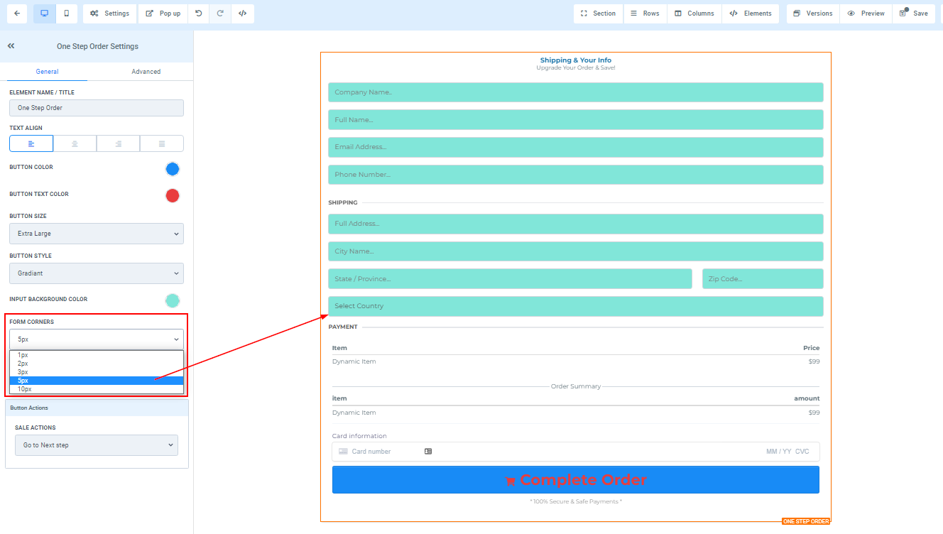
Form Corner
Additionally, under Form Corner, you can adjust the degree of curvature for the edges of your form fields.
Typography Type
For font customization, you can choose the font type for your form by selecting options from the dropdown. You can opt to use the headline or content font that was set up in the settings, or select a custom font from the provided dropdown, giving you a vast selection of fonts to choose from.

Button Action
Sale Actions
Under Button Action, you have the option to choose between Open the popup or Go to website URL for Sale Actions.
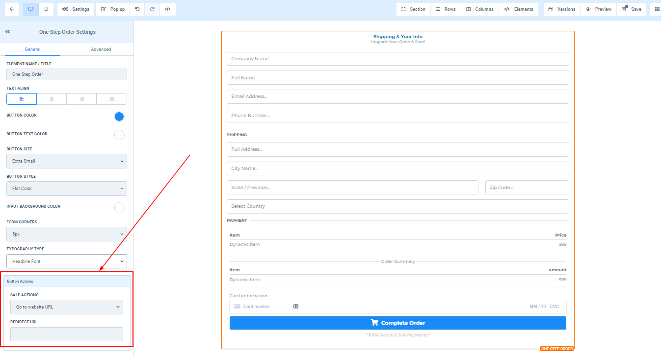
- Website
If you choose Go to website URL in the Image Action icon, you will need to select the web page the button will link to.
- Open In New Tab
Additionally, you can toggle the Open In New Tab feature if you want the webpage to direct users to a new tab upon clicking.
Advanced Settings
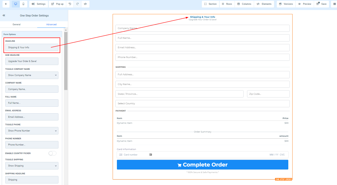
Headline
Here you will see the default headline name and you can decide to leave at that or rename it.
Sub-Headline
Same as the Sub-headline name, you can decide to change it or leave it as it is.

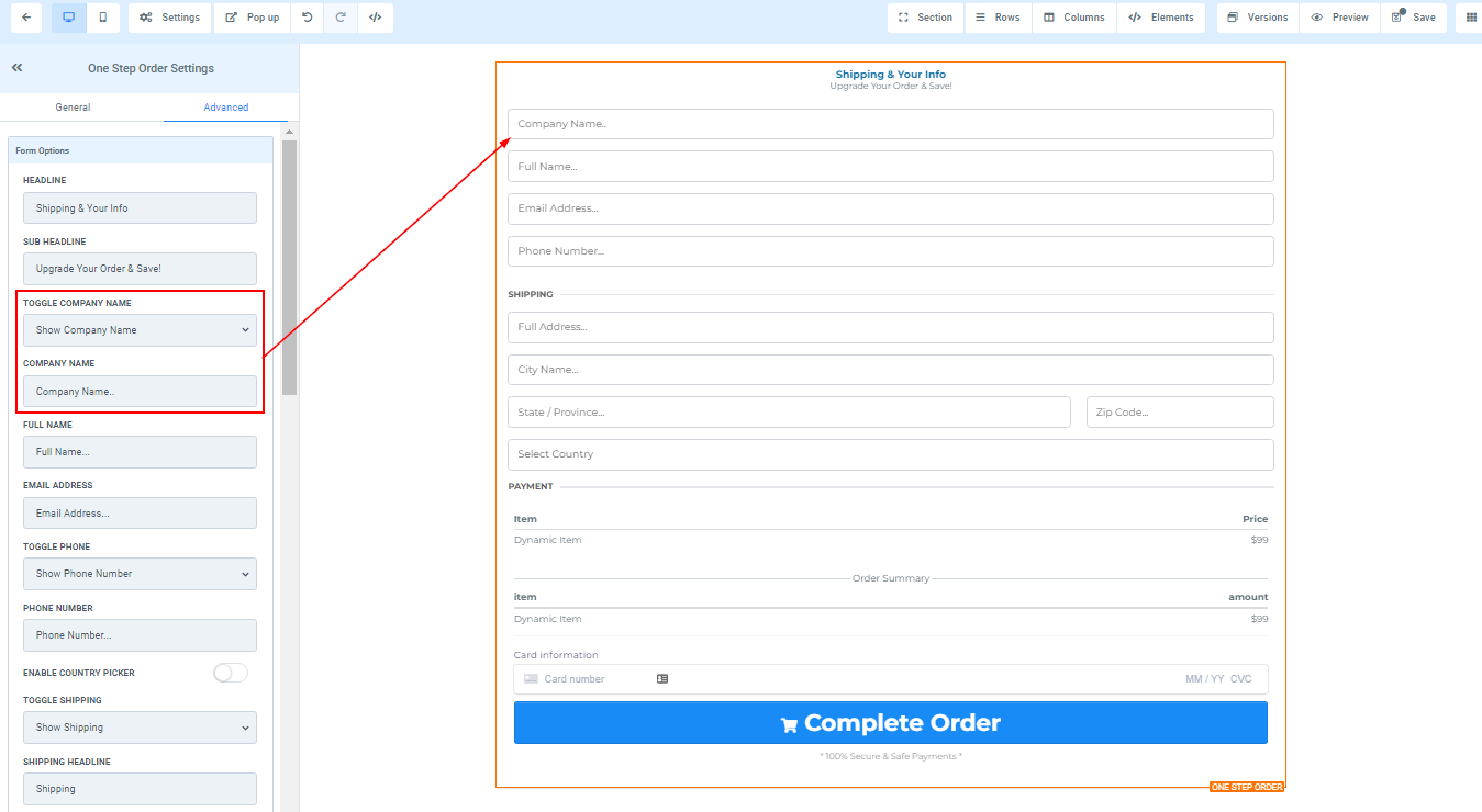
Toggle Company Name
You can decide to show a form field for the "Company name" or you can hide it.
- Company Name
You can edit the description in the company name form field here.
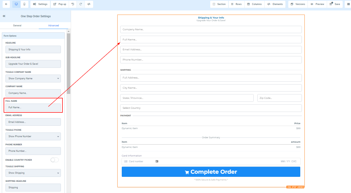
Full Name
You can edit the description in the full name form field here.
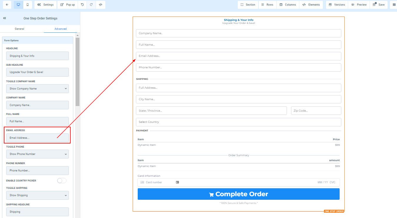
Email Address
You can edit the description in the email address form field here.
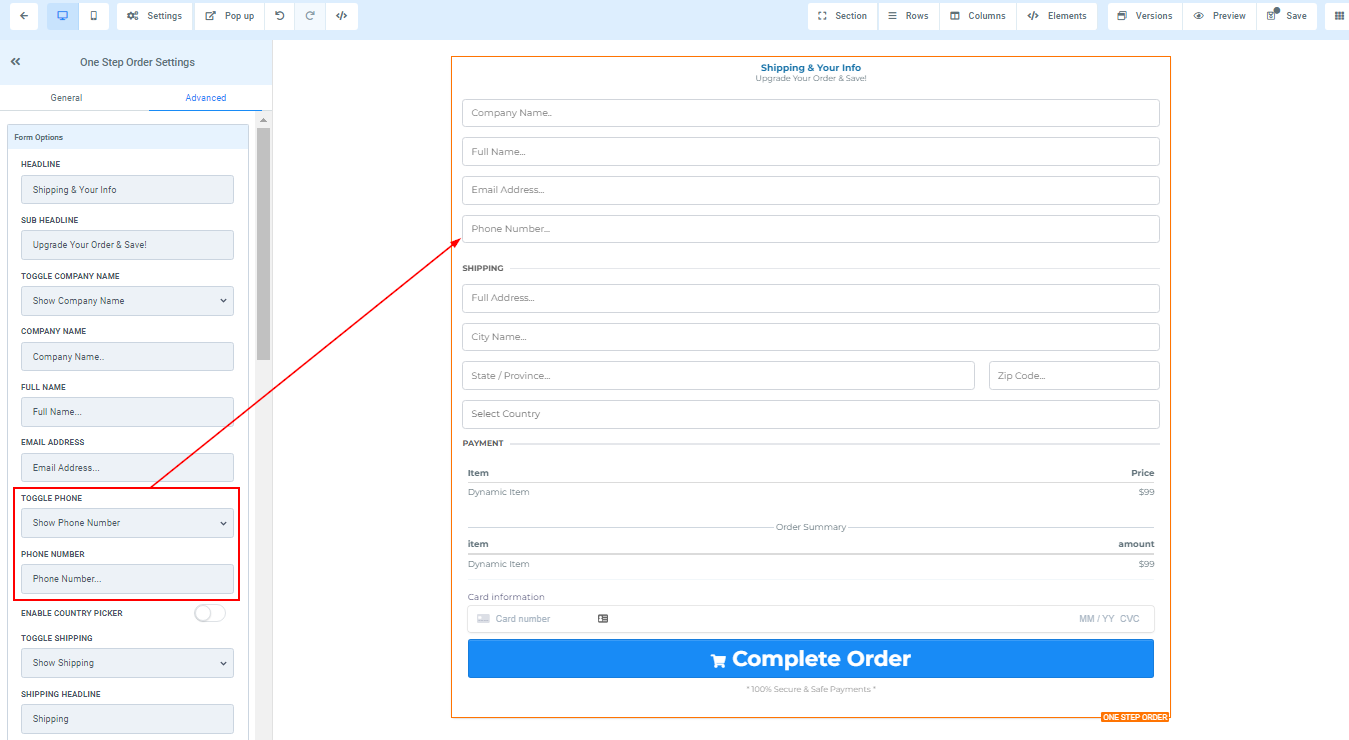
Toggle Phone
You can decide to show a form field for the Phone number or you can hide it.
- Phone Number
You can edit the description in the Phone number form field here.
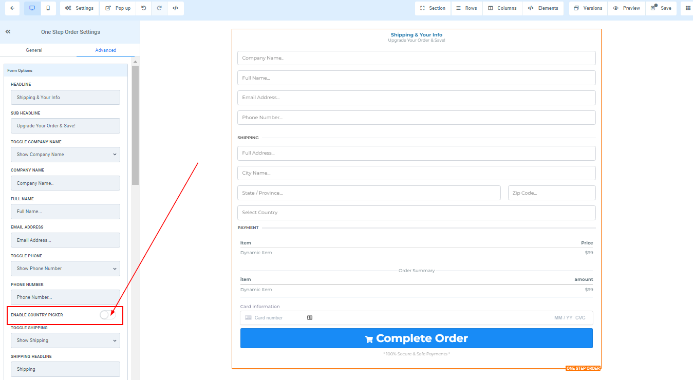
Enable Country Picker
You can toggle on or off the country picker here.
Toggle Shipping
You can decide to show a form field for the Shipping info or you can hide it.

1. Shipping Headline
Here you will see the default shipping headline name and you can decide to leave at that or rename it.
2. Address
You can edit the description in the Address form field here.
3. City
You can edit the description in the City form field here.
4. State/Province
You can edit the description in the State/Province form field here.
5. Zip/Postal Code
You can edit the description in the Zip/postal code form field here.\
6. Country You can input your country here.
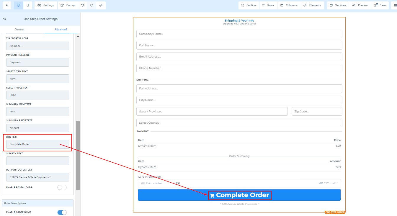
Bin Text
Under the Bin Text option, you can personalize the button text for the next form by revising the text data.
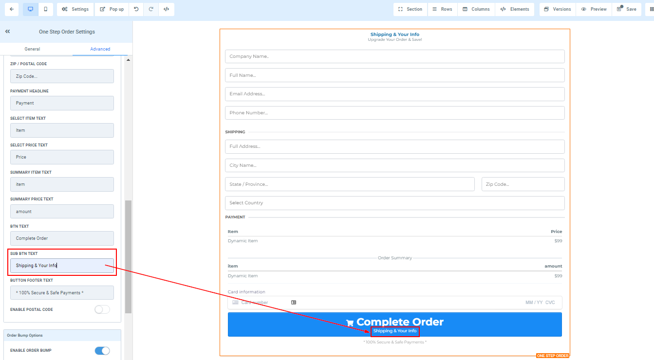
Sub Bin Text
In the Sub Bin Text feature, you can include a sub-text to your button by adding the preferred name.
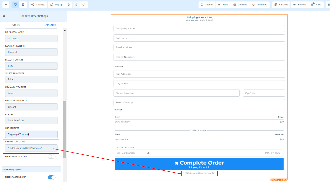
Button Footer Text
Along with this, you can also impart any other vital information that you would like your users/clients to be aware of in the Button Footer Text field.
Order Bump Options
Under the Order Bump Options feature, you have the option to include additional order bump options to your order form.

1. Enable Order bumps
When you toggle on the border bumps, it enables you to order bumps.
2. Select Product
You can select the product you will like to add here.
3. Enable by default
"Enable by default" allows you to set the order bumps to turn on by default.
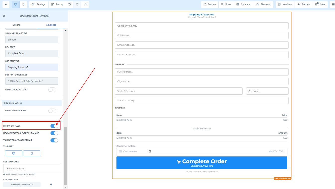
Sticky Contact
To add or remove the sticky contact, use the toggle button located under the Sticky Contact feature.
New Contact on Every Purchase
If you want to create a new contact for every purchase, toggle on or off the New Contact on Every Purchase tab.

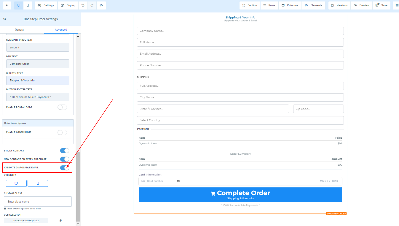
Validate Disposable Email
You can validate any disposable email by toggling this on.
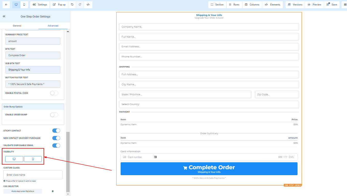
Visibility
You can decide if you want this particular Edit option to be visible on only mobile devices, desktops, or both by clicking on it to highlight the icon.
Custom Class
In the Custom Class field, you can enter your preferred class to customize the form field.

CSS Selector
If you need to copy the Custom CSS, just click on the "Copy" icon on the right side of the reference code.